![IMG_1928[1]](https://ryanthorntongraphicdesign.wordpress.com/wp-content/uploads/2015/09/img_19281.jpg)
This is a quick mind map of what a pop festival should be like. So the colours in my logo need to be bright, the typography needs to be big and curved so it is easy to read and appealing.

This is a quick mind map of what a pop festival should be like. So the colours in my logo need to be bright, the typography needs to be big and curved so it is easy to read and appealing.

This is a drawing of a guitar that was in the studio, it is a traditional drawing with water colours. Firstly, I drew the guitar in pencil so i could get the right shape and then once that was done I went over the pencil lines with a fine pen. This gives the image a finished and smooth appearance. After this I added some water colours, these are just colouring pencils which when you paint with water the colour spreads out and softens.
If I was to do this again next time then I might add some more detail to the guitar using the fine liner.
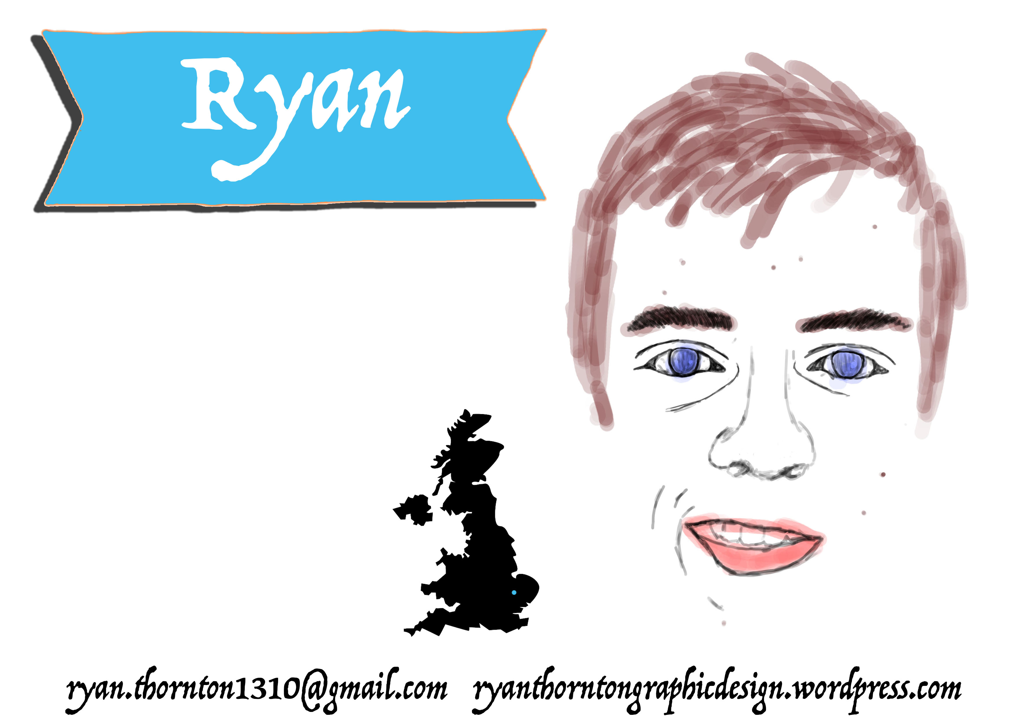
This was digitally made using Photoshop. I made this by focusing on the images from “Lesson 3: Self-promotional postcards” and changed them to make a personal self-promotional postcard. I like the heading in this postcard because it is large meaning that people will focus on that part of the postcard first. Also, the self portrait is a good idea because it shows the employer who I am.
Next time, I would add text to make the postcard say more about me. For example: write about the things I like etc.
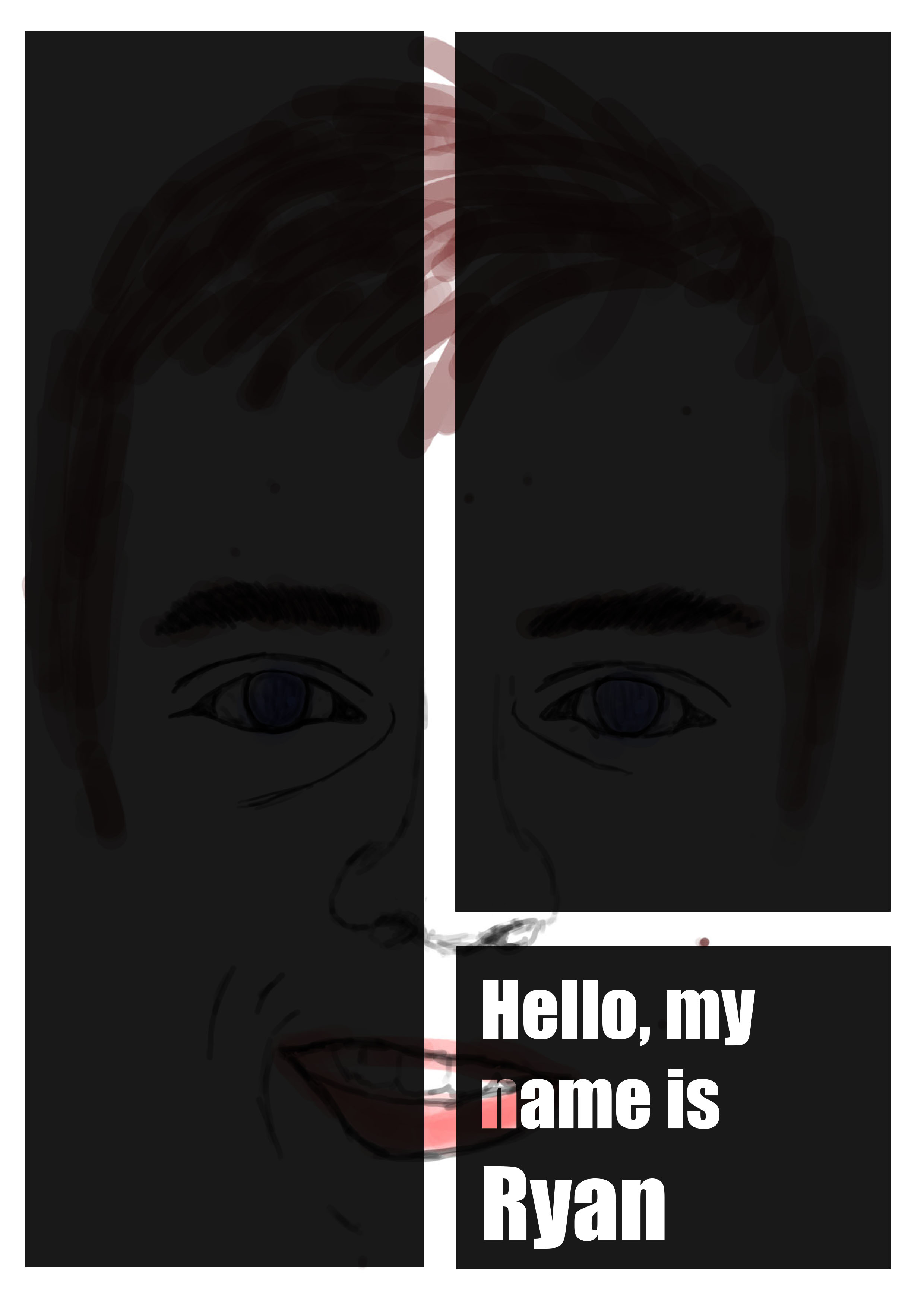
This was also digitally made using Photoshop. The things I like about this postcard is that you can still see the self portrait through the black boxes, also when the text is in the boxes you can see through the text to make the face more visible.
Next time, I would also add more text to finish to off and to make the face more visible.
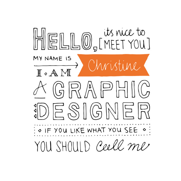
This image is kept simple which is good, also includes a variety of fonts which makes it look appealing and legible. The use of one colour is good because it highlights her name and makes it stand out. With the 2 rhyming words at the end it makes it seem like she is a relaxed character and enjoys her job.
The different shapes and fonts will influence my own self-promotional postcard because I think it was a successful idea.
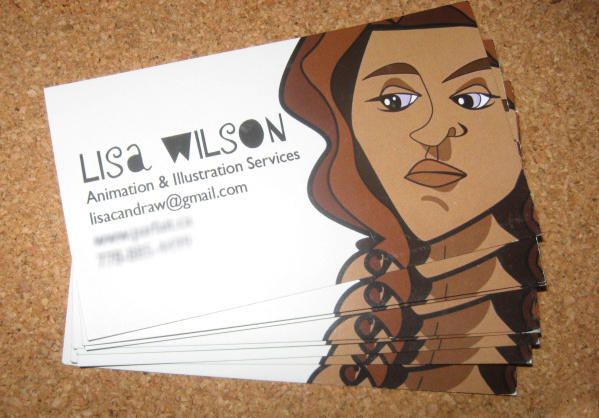
This image doesn’t have a lot of writing to tell you about her but it does give a drawing of what she looks like, which is a good idea because looks is a big part of first impressions. The writing only says her name, job title and email address, the font which she used for her name is eye catching and the font used for her job title is kept simple so it’s easy to read.
The drawing is a good idea because it lets the employer know more about you and it will influence my own self-promotional postcard.
This promotional postcard is kept simple with only the use of 3 colours and the same font. He added his website which leads to a portfolio of his previous work, I think this is a good idea because if you think you can’t fit all your work on a postcard then the employer can just go on his website and see all his work.
The website link will influence my own self-portrait because I think it was a successful idea.

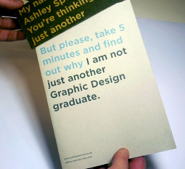
This is a good promotional post card because even though it is small it unfolds to a bigger sheet with more information. She briefly talks about herself and her previous work. Also, she includes images of her work. The colours she chose works well because she uses orange to makes the important aspects of her work stand out.
The unfolding postcard appeals to me and will influence my ow promotional postcard because I think it is a good way to provide more information without the employer having to look at your website.

At first look, this image is well laid out and designed. it is smart and creative with the use of images and shapes. It is kept simple with the use of only 2 main colours, white text on black background, making the text easy to read. Everything is listed very well ( Name, what he does, what he likes etc. ) Also, gives mobile number so it will be easy for someone to contact him if necessary.
I think that with it being creative and witty with the use of images was a good idea and it will influence me when making my own promotional postcard.


These images were made digitally using Photoshop and a Wacom drawing tablet. The advantages of using Photoshop is that you can easily edit and use a variety of tools instantly, also with Wacom it is just like drawing with a pen but on the computer, so you don’t have to use a mouse, which is very helpful.
The difficulties I encountered were that it took me a while to get used to the drawing tablet but once I did it was east to use.
Next time I would make the lines thins and not think (e.g eyebrows) so that when I colour the image it looks slightly better.

This image was created in Photoshop and is made up from 2 images I collected from a magazine. The advantage of using Photoshop is that you can easily edit the image and you can send it to other people via email.
One difficulty I encountered with using Photoshop was that at the start I didn’t really know how to use it.
If I would make this again I wouldn’t include the text at the bottom because I don’t like the look for it, I think this is because the text is too curved and not coloured.

This was my first drawing using a pencil, it is a traditional method of drawing.
The advantages of using a pencil is that it is easy to use, easy to blend together and easy to rub out, this means that if you make a mistake you can easily redo it, which is very helpful. Because the drawing has soft lines its calming and not bold.
I think the image matches the earphones pretty well and the shape is the same. Next time I draw this I would add another earphone because I didn’t have enough room to draw it on top and it would make the drawing seem complete.

This was my first drawing using a fine line pen, it is a quick drying pen which is good because it doesn’t smudge easily.
It is easy to use, however, once you have drawn you cannot rub it out and you cannot blend lines together. It is a bold image with some think and thin line.
Some of the difficulties I encountered were that I couldn’t rub, so when I was writing “Travel” it was quite hard to do and if I messed up then I couldn’t really change it.
I think that I drew the image fairly accurately and the shape is correct. If I was to do this again I would take more time to add more detail for the middle of the image.
