Ticket Design

illuminate ticket template

This ticket was made on a designing program called Indesign. I then downloaded a ticket temple off the Long Road moodle and then added in all of my festival information. In this program you have to create boxes and then you can place images and text inside them. To start of with it was a little bit difficult to get use to because it is different in Photoshop and Illustrator. The same as my posters, I have made a black background so my logo doesn’t look out of place. The important information on the ticket is the largest text and then the lesser important are the smaller pieces of text, this is so that when people read the ticket they read the more important information because it is the biggest and then after they read the smaller parts. On the ticket there is everything that is needed: Festival name, Acts that appear at the festival, date, time, location and your ticket number.

Games Posters

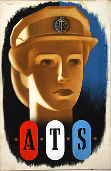
220px-INF3-113_Forces_Recruitment_ATS_(girl's_head)_Artist_Abram_GamesFestival_of_Britain

The first image is a poster for recruitment during World War II. I like the way the letters “ATS” are fitted inside dog tags, these resemble soldiers. The colours are red, white and blue which are the colours of the British flag, making it represent our country. The style of font also suites the type of poster, it is an army style of font. The ATS was the women’s branch of the British Army, the image in the background is a women so it shows that they are recruiting women. 

The second image is a poster for the Festival of Britain and was created in 1951. It was a festival to celebrate Britain’s contribution to the war. The colours used are again, red, white and blue which are the colours of the British flag. The poster shows some flags hanging from either end of the soldier in the middle, these are commonly used in celebrations so the audience instantly knowns what it’s about. The focus point of the poster is the solider in the middle and then your eyes slowly move outwards, over the flags and then the text. 


Developing Posters

Poster Idea 1 with text 2

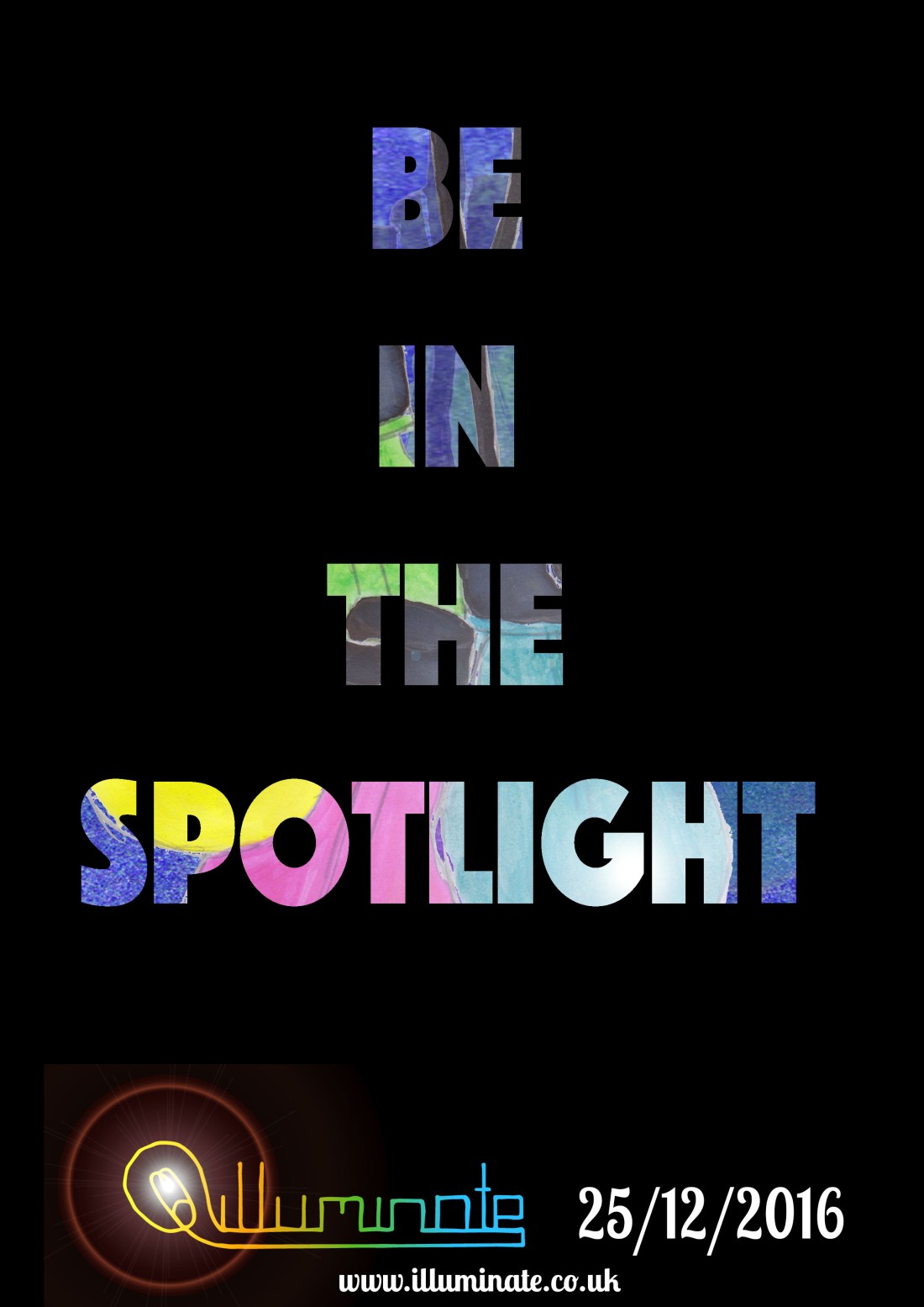
These 2 posters are a development of the one I liked from my Poster Ideas. They were both made in Photoshop and it was fairly easy to do. First we had to come up with different with a couple of words that would relate to our festival, my two lines were “Be in the spotlight” and “Join the light”.

In the top poster I put the text into the middle of the screen and above the ink and bleach layer. I then rasterized the text so it was an image, this allowed me to select each part and then delete the lettering. Leaving the image showing through because it is a layer below.

The bottom poster just has the same text repeated over and over again but as different sizes and opacity. Like before I rasterized 1 piece of text and then changed the shape of it then, this made it easier to change the shape and opacity, also to cop and paste.

Out of the 2 posters I prefer the top one, this is because I feel the text suites background well. With the text being big, bold and clear to read it makes it stand out. Also the light bulbs behind give it some colour so it isn’t bland and boring.

Poster Idea 1 with text

Poster Ideas

Poster Idea 1

The first image was made in Photoshop, I made a black background so my logo could fit nicely into the poster, the texture background is the one I made before using a metallic paint but I changed the colour to a blue.

I made the light bulbs from using ink and bleach, firstly sketched my drawing with a pencil and then went over the cables with ink. Coloured the bulbs bright paints and then bleached both to create shading.

the information at the bottom is just my logo, website and date of the festival. Putting the website on a poster is a good idea because you don’t have to put all the information on the poster (only the main parts) and then the rest can go on the website, including more images etc.

The second image was also made in Photoshop and is fairly similar to the one above, only the change in colour and layout. Still having some important information included like logo, website and date.

I prefer the first poster over the second because I feel you can relate it more with the theme of pop. The included texture makes it look a lot better and the information is clear, easy to read at the bottom, all in one place.

Poster Idea 2

Abram Games

Early Life: He was born in Whitechapel, London on the 29th July 1914 and died on the 27th August 1996 ( making him aged 82). Games left his college at the age of 16 and went to Saint Martin’s School of Art. In 1934, his entry in the Health Council Competition came second and in 1935 he entered a competition for London City Council and won. 1936-1940 he became his own freelance poster artist. 

Career: He was known to be the best of 20th century graphics designers. His career lasted over six decades and his work became a record of the era’s social history. Some of Britain’s most iconic images are designed by Game. For example, “Join the ATS” also known as the “Blonde Bombshell” recruiting poster. During World War II, he was asked to make Official War Posters, he created over 100 different poster. 

His work has “Striking colours, Bold graphic ideas, and beautiful integrated typography”. 

After World War II he became a visiting lecture in graphic design at London’s Royal College of Art, he was also awarded the OBE for services in graphic design.

UCS – University Campus Suffolk

UCS-logo

In todays lesson we had someone come in and talk to us about UCS and the courses that they provide. She briefly spoke about the campus and everything that you can get involved in. For example, the galleries, London trips and awards that can be won. She then spoke about the the Graphic Design and Illustration courses, she showed us some of the students work and how the Level 6 work can be seen as professionals. 

She also mentioned that the university is on a waterfront and you can get a room there or travel in for the 3 times you are at campus.

The courses that she spoke about seemed interesting and when I went on the UCS website I found a Game Design course that also interested me. 

I’m not to sure whether I want to go to university or not yet, I haven’t started looking at other opportunities but UCS seems like a good choice and i’m looking forward to find out more about the courses they provide.