Graphic Designer: Kate Molloy

Kate Molloy is a graphic designer whom owns a company called ‘Little Designs Cambridge’, she has owned this company for 5 years and is a professional in her work. She works with illustration, logo design, typography and digital design. I think that this opportunity is really important because I get to show my work to someone that knows what they are talking about and are very experienced, she can help me by saying positive and negative comments that will help me to improve my work further. She can give me an insight on what concepts work best for certain client needs and how to produce an overall effective piece of content.

I will be presenting my work in Google Slides as this it is a simple piece of software that I can use. I will go through my work in a chronological order so that it all makes sense and nothing is completely random which my confuse and uninterested her. Including a couple of photos of my work in each slide will be an effective way to show her my work and with a little bit of information on how I came up with these ideas etc. Also, I will talk about which ones I personally like the best and ask her questions on how I could improve these thumbnails further and one’s that she likes which I could refine/develop.

Research – Frame by Frame

Frame by frame is used to tell a story, it makes the audience more active as they look at each individual image and think about each one. This concept goes back many many years, Romans used this graphic to show others stories (113 ce)and Egyptians used frame drawings of Gods in memorabilia.

The work of a Swiss author, Rodolphe Topffer, came into light in the 19th century, with a frame by frame graphic including words and pictures. However, recently designers have been telling stories through frames wordless – this helps to express a concept. In 1992 a children’s picture book was designed ‘El Lissitzky’s About Two Squares: A Supermatist Tale’. This book symbolised the Russian revolution of 1917, with a red and black square, the red symbolised the new revolution order with unlimited possibilities and has conflict with the black square, which shown old order.

I think that this concept is successful and would really look well as a web banner, with only a few frames going across. Although you can have just a static image the before and after frames can add amusement to the content.

frame-by-frame-1

Title – Dubo Dubon Dubonnet , Designer – A.M Cassandre

Source – Heller, S and Vienne, V (2012) 100 Ideas That Changed Graphic Design, London, Laurence King Publishing Ltd.

Analysis on Dubo Dubon Dubonnet:

This poster is designed by A.M Cassandre whom is a French-Ukrainian designer and teacher. He moved to Paris to study Arts at the Academie Julian.  He designed this poster for the Wine company Dubonnet, the use of this concept works well because it shows a ‘short film’ of the process a man goes through to pour a glass of wine and then once he finishes that he pours another. As you move from the left to right and interact with the poster each frame slowly fills in, as he fills himself with wine.

The lettering as well fills in from starting off as ‘Dubo’ then ‘Dubon’ and finally the company name ‘Dubonnet’, this also roughly translates to “It’s nice, it’s good, it’s Dubonnet”, giving the company a positive review and to help marketing. The first frame starts off as a fairly dull and colourless image, then brightens up as you move across, grasping your attention all the way through till the end because that is where the main focal point is.

I really like the idea that Cassandre has used that is each frame slowly starts to fill with colour. I think that this is successful because it keeps the audience interested as each frame slowly increases with bright colour until they finally look at the final image/product.

frame-by-frame-2

Title – Mostly Mozart Festival (1983) , Designer – Unknown

Source – Heller, S and Vienne, V (2012) 100 Ideas That Changed Graphic Design, London, Laurence King Publishing Ltd.

Analysis on Mostly Mozart Festival:

This poster is designed in the name of Mozart and there is now a Mostly Mozart Festival concert that covers a lot of his musically work. I couldn’t find the designer for this work however what they have done works well. I think that it is creative in the way that they have capture the sneeze from Mozart, as he was passionate with music this shows a somewhat comedic side as you wouldn’t normally see celebrities sneeze. The thought of Mozart sneezing shows us that even the musically genius can be mortal for a scene, but only one scene.

The designer has used this concept to show what I’ve just said, using Frame by Frames you can show and capture individual movements – capturing the sneeze then everything going back to normal.

I think that they have used this concept well because the before and after of a sneeze takes a few seconds and you can’t show that with a single still image, whereas using multiple still images it creates an animation in your head.

Research – Dynamic Diagonals

Dynamic diagonals are a good way to make the audience look at a certain thing, it makes the eye move around the page and directed to a point, creating tension with the angle of the shapes. These shapes/lines can also create depth in a designers work, if you have more diagonals in an image then this will increase the depth that is given off, also having the angles perpendicular to one another (instead of parallel) can make the image look more forward.

The 1930’s was when a Russian graphic designer used diagonals in one of his work, Gustav Klutsis’ poster ‘Workers’. At the time he made the poster it summed up the period of time fairly well, the image is off stacked hands – tilted at a steep angle, the text on the poster then seems to be holding up the image as it’s angled in the opposite direction. As years past on diagonal layouts were favoured but weren’t required as a graphic infrastructure. Designers would choose to have right-leaning images instead of Klutsis’ image of left-leaning hand. Recently, designer have even started to combine up-down with right-left creating an intriguing look.

dynamic-diagonals-1

Title – Pulchri Studio (2006) , Designer – Studio Dumbar

Source – Heller, S and Vienne, V (2012) 100 Ideas That Changed Graphic Design, London, Laurence King Publishing Ltd.

Analysis on Pulchri Studio:

The concept of Diagonal’s is the only thing that has been used in this poster, the content is based on an arts shows and therefore the paint drops are at an angle, all of the drops are angled in one direction, whereas the smaller text in the background is angled in different directions. As the ‘background’ lettering is smaller and perpendicular to the paint drops it makes it seem that the drops are more forward. This poster was created 70 years after the ‘Workers’ by Gustav Klutsis, this shows us that the concept has carried on for a long time and hasn’t changed much, as the colour pallet is similar with simple solid colours. The rain drops are brighter than the background, which is a deep brown. The main text for the poster is inside the raindrops, therefore you need to have these the main focal points. This is done with the Diagonals and the solid block colours. When rain drops / paint drops fall they don’t always fall straight down and sometimes fall side ways, the diagonals make the piece seem more realistic and still keeping the artist feel, as it’s an art show.

I think that this piece of work has been successful in using the concept throughout the poster. The main focal points are on the paint drops which is what the designer wanted. This is done well with the use of strong colours and shapes.

dynamic-diagonals-2

Title – Workers (1930), Designer – Gustav Klutsis

Source – Heller, S and Vienne, V (2012) 100 Ideas That Changed Graphic Design, London, Laurence King Publishing Ltd.

Analysis on Workers:

Gustav Klutsis was a Latvian photography and is known for the Soviet revolutionary and Stalinist propaganda. The dynamic diagonals are used in this concept with the help of a collage of hands. Klutsis’ poster is set against a strong red background with the hands set at a -45 degree and then the text at 45 degree. The tilt on the hands is dramatic and it would seem to be falling over if it wasn’t propped up by the text.

Looking at Klutsis’ background it seems that this poster could be a piece of propaganda – this can also be seen by the raised hands and the few faces on the page. Although I don’t know what the text says (some research indicates it could be: Let’s fulfil the Plan of Great Works) the font used is big and bold, making it easy to read. As a propaganda poster I think that this is successful as the text seems to be persuasive and the multiple hands symbolises unity – making everyone join together.

Although this has been good to research I don’t think that this concept will be used in my final design. This is because I don’t find it too interesting because all the examples I’ve looked at there hasn’t been much detail in the work. The most has probably been ‘Workers’ and that is only due to the collage of hands.

Research – Nostalgia

Nostalgia is the idea of using trends from the past to make people in the modern world feel fond towards content that they may have seen in the past. This can be used to interest the audience by making them want to buy your content because when they were younger if the content was good it would also be rememberable, and they may want to relive that rememberable moment.

Nostalgia has been around for decades and many graphics designers have revamped original ideas. Fashion trends are often revived, like fashion graphics design is artistic – and both tend to come back as a trend sometime soon after their discontinue. One of the first recorded designers using this idea was Push Pin Studios, they used typefaces from the past to update their contours. Even nowadays nostalgia picks up interesting graphic content. Example would be, back in 2008 polaroid cameras were no longer selling, now, designers have made polaroid filters on phones so it look likes it has come straight from an old polaroid camera.

Classic retro video games can be very nostalgic for young adults nowadays, I could use this research if I want to appeal to young adults when advertising cars. I personally like this concept because I can think of some retro games that I liked when I played them at a younger age, and you get a good feeling when you play an old game that you remember well.

nostalgia-1

Title – Pacman, Space invaders and Centipede Poster for Sony’s PIXELS ,                       Designer – Unknown

Source – https://www.google.co.uk/search?q=pixels+(2011)+short+animation&espv=2&biw=1790&bih=903&tbm=isch&source=lnms&sa=X&ved=0ahUKEwj17fyk9qLPAhXHDsAKHc1OAfEQ_AUIBygC#imgrc=LEIdovlVqFVh4M%3A

Analysis on Pacman, Space invaders and Centipede Poster for Sony’s PIXELS:

The concept of Nostalgia has been used in this artwork to show a film. The retro games are vibrant and large to make them the first thing you see on the page. The images are pixelated to keep the message that these are retro games because back in the day, the games didn’t have very good graphics and were very pixelated. The characters from the games interact with the landscape which helps give the effect that it is part of real life, the Pacman is eating away at the city (in the game the Pacman would go around eating balls), the Space Invader seems to be turning around the Eiffel Tower as it is angled to side facing it, and the Centipede is floating around trying to catch the mushrooms (like in the game), so these posters have keep the meaning of each game very well because their target audience would be able to related there past experiences with these games very well.

I think that these posters are successful because they advertise a film in which their target audience are young adults, using nostalgia can help relate young adults with there past and therefore they may want to see this film to remind them of their past.

Most people that buy their first car are young adults, so this concept could work well with that target audience, producing a piece of content that shows a cheap car that could be your first with in a retro game.

nostalgia-2

Title – Water Torture Escape (1974) , Designer – Seymour Chwast

Source – Heller, S and Vienne, V (2012) 100 Ideas That Changed Graphic Design, London, Laurence King Publishing Ltd.

Analysis on Water Torture Escape:

My second example of a design that shows Nostalgia is called ‘Water Torture Escape and it was designed by Seymour Chwast and was advertised in 1974. This poster is to advertise a television channel for a magic show, this piece is nostalgic because it shows Harry Houdini, whom is a famous magician with one of his most famous tricks being the Chinese Water Torture Cell. Houdini was around in the 19th century so he was an iconic figure for people in 1970, therefore if people would see his work or something familiar then they would remember his work – nostalgic. The colours from this poster have the nostalgic style, where they are solid colours and a small amount of detail – I have seen this with other research I have done into ‘Nostalgia’

I think that the message of this poster is strong because people will recognise who the man is and they will be intrigued to watch the show to see more of his famous magic tricks – this makes the design successful as it keeps the mysterious magician feel and the colours match an old style, staying solid and little colour.

I personally like the colour scheme in this design as it gives that old style off and it is very clear what is happening in the poster. I may use this colour scheme in my own work as it would also help to show a nostalgic theme  – I may add more detail to the background of my idea as i think this ‘Water Torture Escape’ may be a little too plain.


Research – High contrast

This concept removes all the middle tones in a raw photograph, leaving only the darkest and brightest highlights. Kodak’s Kodalith paper was invented in 1931 to undergo this process. This method removed time – consuming methods such as airbrush retouching as it could be down by hand or darkroom methods.

In the 1960’s Kodalithing was firstly used to reduce production costs, however it fuelled a counter-culture aesthetic with bold graphics. This era was highly political, and Kodalith aided in graphic subversion where he used this concept to mask part of halftone photographs, examples of left-wing leaders were put under high contrast on posters ad t-shirts. Because this concept removes the majority of detail in an image it can turn realistic photos to abstract images, Kodalith made boring images ‘artistic’ as the high contrast leaves the image with mystery.

Although I do like this concept, I don’t think it will influence me in my designs. I like the way that this concept simplifies and image by taking away the mid tones, only leaving the shadows and highlights.

high-contrast-1

Title – Stadt Theatre Basel (1963) , Designer – Armin Hofmann

Source – Heller, S and Vienne, V (2012) 100 Ideas That Changed Graphic Design, London, Laurence King Publishing Ltd.

Analysis on Stadt Theater Basel: 

This poster was designed by a man named Armin Hofmann, he taught arts and crafts and studied graphics design. The use of this concept works well for the client as they are a theatre, therefore performing arts,  plays are can be dark and people are in the spotlight, this concept removes the mid tones and only leaves the shadows and highlights. It looks like the hands could be lit up by the stage lights in a performance, the gestures also help to convey that this poster is for a theatre because they are very over exaggerated. Armin Hofmann is well known for his simplicity, which is probably why he chose to use shadows and highlights as these are only two colours and the image can easily  be seen as they contrast. The text to the side is very bold which is good to get the information across to the audience. These colours give a strong dramatic feel to the poster which also resembles the theatre itself.

I think that this poster is successful because it look like the inside of a theatre with the shadows and highlights, Armin Hofmann has kept this poster simple but effective die to the hand gestures. I think that if this design didn’t use the concept of High Contrast then it would be as strong and powerful, however I don’t think I would use this in my own design because for a design like this to be effective you can’t have it overloaded with objects otherwise it will get too confusing and not work as well.

high-contrast-2

Title – Mad Men , Designer – Unknown

Source – http://www.impawards.com/tv/mad_men_xlg.html

Analysis on Mad Men:

This poster is an advert for the TV series ‘Mad Men’. There isn’t too much background into this poster as it’s an advert – it mainly shows information regarding the series. The ‘Mad Men’ TV show is about an alpha male Don Draper who struggles to stay on top of the heap in the high-pressure world of Madison Avenue advertising firms. I assume that the man in the poster is Don Draper as he is the main character in the show – you can also tell this by the use of ‘High Contrast’, the white colouring for his shirt and cigarette contrasting with the black suite provides a powerful impact on the viewer, showing them that he is the alpha male and shouldn’t be messed around with.

I think that the use of ‘High Contrast’ works really well in this because you can add an additional colour to make it stand out and makes it very clear to see. Especially with the use of the colour red, which is a strong dramatic colour makes your eye attract to that first. What the designer has done is they have put this over the important information, there the viewer knows the key points first and don’t miss anything – which I think is successful.


Research – Close Up

Close ups are one way that graphic designers objectify photographs, alongside cropping, retouching and distorting. Close up’s allow emphasise between the differences in foreground and background. Contemporary designers bank on the idea of extreme close ups and even editing these with drawings over the top – creating an ‘in your face impression’.

A Russian artist Aleksander Rodchenko used his own photographs which he enlarged and cropped for his collages. In 2001, two designers Mathias Augustyniak and Michael Amzalag were one of the first to use this concept successfully.

I really like the concept of close ups, it is simple idea which makes a big difference within the designers content. You cannot help to look at the image because it is so large, which could be good for an idea that is alarming, making the audience look at it even if they don’t want to, for car’s this idea could be road safety. I will most likely use a close up of a part of a car in either my magazine or web banner because it helps to just show a single part of the car.

close-up-1

Title – Schützt das Kind , Designer – Josef Muller-Brockmann

Source – Heller, S and Vienne, V (2012) 100 Ideas That Changed Graphic Design, London, Laurence King Publishing Ltd.

Analysis on Schützt das Kind: 

This poster was designed by a man called Josef Muller-Brockmann, he’s a Swiss designer, teacher and even wrote some of his own books. This poster uses the concept of Close Ups to pursue an uneasy feeling and to create a dramatic effect. The close up is of a motorbike wheel which takes up the majority of the page, and in the background there is a small child. This poster is aimed to try and stop drivers from speeding and to reduce the risks. The wheel is the close up and makes you feel really close to it, making it seems like you are close to that situation which would obviously make you feel uncomfortable. The child in the background is a lot smaller to show how large the wheel is and to give depth to the image, also the child is moving back and forth – being indecisive making it a lot harder for the speeding motorist to make a decision.

The whole bike is black to give it a predominate impression, as well as the blurred lines to show the speed of the bike. With the dark mood of the bike, the bright yellow flooring is there to attract you to the incoming accident, still putting fear in your mind and trying to make it a memorable scene.

I think that this concepts works well for this theme of making the audience aware of something, because close ups can make you feel like you’re right in the moment and project fear/uncertainty, which this poster does well – to try and make you stop speeding. Without the use of a close up then the poster wouldn’t be as dramatic and therefore less memorable. This could influence me in my own work by doing something similar such as  road safety and how the car that I am advertising is the safest on the roads.

close-up-2

Title – Pontresina (1935) , Designer – Herbert Matter

Source – Heller, S and Vienne, V (2012) 100 Ideas That Changed Graphic Design, London, Laurence King Publishing Ltd.

Analysis on Pontresina: 

This Swiss poster was designed by a man called Herbert Matter, he was inspired by Aleksander Rodchenko’s close up work – for a ski resort. The over scaled face dwarfs the man in the background. The main feature I get from this poster is that it’s a nice place to go to, this is due to the highlights on the mans face show that it is fairly sunny there and in the background the mountains look appealing and the skier looks professional. I don’t seem to be getting any messages from this advert as it’s not too clear to why the designer has used a close up in this work.

I also don’t like the way Matter has designed the font. I think that it looks a little tacky and it is fairly difficult to read as it changes colour mid-way through and it seems to blend in with the background. Although, he has made the ‘sky’ part of the font cover the man so it’s not over the background which would make it impossible to read.


Research – Ornamentation

This concept questions how important is decoration, it is used to enhance a product and to illuminate content rather than obscure. However, decoration is too frequently used to conceal faulty merchandise, which makes it neither good or bad. Architect Adolf Loos asserted certainty that ornament was a sin in his essay 1908 essay ‘Ornament and Crime’.

The 2000’s have seen a revival in both old and new decorative techniques due to computers making designing easier. Some critics argue that decoration in graphic design and other content add no functionality or durability. However, a good example, is the euro paper currency, it has vibrant graphic elements and bright colours, making it look official and human at the same time.

I like this concept because decoration can add a small amount of  detail to a piece without taking away from the main idea. I think I could use this in my design if I thought that at first it was too bland.

ornamentation-1

Title – National Poetry Month (2010) , Designer – Marian Bantjes

Source – Heller, S and Vienne, V (2012) 100 Ideas That Changed Graphic Design, London, Laurence King Publishing Ltd.

Analysis on National Poetry Month:

This poster is designed by Marian Bantjes whom is a Canadian artist as well as a graphic designer. This poster was made for the 2010 National Poetry Month. The designer has used ornamentation very elegantly and most of the decoration is symmetrical. This style has gave an overall impression that it is fairly royal because of the typography and colours used, the golds and blues help with this as they are calm neutral colour, compared to a red which is more angry.  Also the way the decoration has been placed is very symmetrical, the golden stars are all ordered and the patterns in the circles are well placed and fancy. The shapes and lines links well with the concept, although it is all fairly busy and seems like a lot is going on at once, it is all ordered and professional, shows that this could be like what the actual event will be like. Fairly busy however controlled and professional.

I think that this piece is successful for meeting the concept and portrays a professional style. I personally don’t think I will use this concept in my own work as it doesn’t really inspire me with many ideas although if it is done well it looks very nice.

ornamentation-2


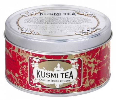
Title – Kusmi Tea Product , Designer – Unknown

Source – Heller, S and Vienne, V (2012) 100 Ideas That Changed Graphic Design, London, Laurence King Publishing Ltd.

Analysis on Kusmi Tea Product: 

This design isn’t so much a magazine spread or web banner so it doesn’t match the brief we were given, however it does still contain ornamentation – adding small details around the product to give a unique style. This whole tin is covered in decoration: the tin has most of the information on however still there are small flowers surroundings the outside; the surface of the tin is covered in what seems more close up images of flowers which are coloured with gold, making it stand out against the red background; and finally the name of the product sits inside the outline of a building which is surrounded by flowers.

Although this product isn’t a poster design / web banner there doesn’t seem to be a possible message that can be delivered. However, as this is a tea company they keep the theme of flowers solid throughout the packaging. This can be clearly related back to the Kusmi Tea as flowers is where tea comes from.

I think that this packaging is successful because packaging tries to sell you a product, this does that well with the help of the use of flowers surrounding the tin. The colours in this design also keep the theme calm and nothing clashes to disturb the consumer – reds and golds.


Initial Car Advertisement Research

There are many differences between the Vintage car adverts and the Modern day adverts. Some of them being the type face has changed over the years, the modern day car adverts font is cleaner and sharper – giving it a more professional look. Another difference between the two adverts are colour. Apart from my last modern image the other two don’t use very much colour compared to the vintage adverts..These vintage images use colour all over the adverts, sometimes with a vast array of colours. Bright blues and reds are used a fair amount and the overall graphics of these adverts are somewhat cartoon ish.

Regarding my modern car adverts, the similarities are that all the cars are fairly large and cover most of the advert – also showing mainly the front of the car, never seen the back or inside as much as vintage adverts. Another point with the modern adverts would be that there are normally sharp lines, as these are fast cars these lines show the speed and make the advert seem more dramatic. In all 3 of the adverts all contain the logo of the car company, this is something that doesn’t appear in the vintage adverts. There is also a lot more text, firstly a slogan for the advert that is larger than the small print, this slogan is used to sell the car because this is the first piece of text that you see. 

In my vintage adverts, all of the images only have a few words, mainly a title of the advert and then maybe a slogan. I believe that over the years people have become more interested in what they are buying so they care about the fine detail a lot more than in the 20th century, therefore the modern car adverts would have a lot information on the car and the company – small print.

The text in the modern adverts are all monochromatic, this keeps the text simple and less distracting compared to the vintage adverts (with their bright colours) helping to keep the car the main focus point.

Similarities that occur with both vintage and modern adverts are that the text that is used is persuasive, this is because the car company is trying to sell a product so they need to try and persuade their target audience to buy this car and not another brand. They persuade the audience using their slogans, because they a short lines and can be catchy i.e “Red Hot and new”. Other words that helped include “intelligence” and “joy”, these show use that the technology in the car is at a high standard and that the car is joyful to ride, you won’t be bored driving their cars.

A similarity with the modern adverts are that the text  stays out of the way of the images used, this way the reader doesn’t get too confused and it’s keeping the whole advert clean. This is different with the vintage adverts, they have text involved within the images.

Vintage Car Adverts:

1942 DeSoto Brochure Cover | por aldenjewell:

No artist, 1942, no title

No artist, no year, no title

http://billcarnes.blogspot.co.uk/2012/04/vintage-car-ads-part-17.html

1962 Ford Mercury Car Ad Red Leather Seats Auto by AdVintageCom:

No artist, 1962, no title

Modern Car Adverts:

Image result for car advertisements in magazines

No artist, 2015, no title

No artist, no year, no title

http://favbulous.com/post/1280/46-stunningly-creative-car-ads

No artist, no year, no title

http://favbulous.com/post/1280/46-stunningly-creative-car-ads

Bibliography

Source – Heller, S and Vienne, V (2012) 100 Ideas That Changed Graphic Design, London, Laurence King Publishing Ltd.

– A book, For each piece of research I used 1 image.

LittleDC

– Little Designs Cambridge, Presentation for Kate Molloy.

https://www.google.co.uk/searchq=car+advert+slogan&espv=2&biw=1920&bih=950&source=lnms&tbm=isch&sa=X&ved=0ahUKEwiP_sXR7tXPAhWKORoKHaPcCTIQ_AUIBigB

– Google, Research into Titles and Slogans.

http://www.1001fonts.com/retro+video-game-fonts.html

– Arcade Classic video game font, Used for Font and Slogan.

ASSESSMENT 1 UNIT 3 – Car Advertisement Design

The client for this assessment will be an advertising agency. The target market for this brief are customers that are looking to buy a new car, possibly from their favourite brand. I think I will be creating a modern/sports car advert however I’m not too sure on what type of brand I will use. The demands of the brief are that the designs I produce must visually link to a sport/vintage car aesthetic, also to have a strong link to past graphic design/art movement and that the designs show ‘out of the box’ thinking. The client needs me to produce a single page advert to be printed and also a web banner for a website. The constraints of the brief are that the product needs to be linked to past graphic design movements, and sport/vintage aesthetics. I’m feeling good about the start of this brief as  I like the how we are allowed to be ‘out of the box’ and create  unique designs.