
For my Magazine Spread:


The first step in my design was to draw an outline for the game machine. To draw this I used a thin (4) black brush – in Photoshop you can hold down the ‘shift’ key to get straight lines which help a lot with this project. In the next image I added in buttons to the bottom of the machine, then some boxes for information e.g. Title and Slogans so my audience knew what they were buying. And then the final image is of the outline of the game screen – Sonic the Hedgehog. I outlined an image from the game itself so that my drawing would look familiar to a player of the game.


I then created a new layer and added solid colours to my design. I made the game machine mainly grey and black so that it was obvious what it was but not eye catching so my consumer isn’t distracted. I also matched the colours of the Sonic game so that it kept the familiar feel, I chose to colour the Mini in red as this was the colour that I saw the most when I was doing research into the company. The next image I added in the text, I used a free retro font from the internet which matches my theme perfectly, I changed the colour of the font so that it would stand out against the black / grey game machine. I created the shadow of the text by duplicating the yellow text, then changing the colour to grey, setting the grey layer behind the yellow layer and then moving it to the bottom-right ever so slightly. I think that this works well as it doesn’t make the text seem flat and 2D.


I was happy with the previous images above but I thought that I could’ve added more detail into my design. I chose to add some shadows to the buttons on the game machine an from the feedback i got from the ‘Car enthusiasts’ I also added in a Mini Logo – to help show that this poster is for selling Mini’s. Adding the shadows to the buttons was fairly easy to do, I used the lasso tool in Photoshop to select a small part of my design, and then brushed over that area with a darker shade of colour to make it give a shaded effect, I think that this worked well and looks better than the previous ‘flat’ buttons. In the next image I added in some brick work to the Sonic game, I did this because my previous design was flat was seemed to be a little boring. I think that the random sized bricks look interesting and work well in my design and it makes the whole screen ‘pop’ much more, I did this by selecting a lighter shade of the background and then changing the brush size (15-35)
to get random shaped bricks. I also added the reflection oft he clouds onto the water to make it seem further away from the platform – creating more depth in my design.


I then put my final design into and action that we were given at the start of the brief, this action turned my design into a more realistic magazine spread – by adding highlights, a second page, shadows and curves in the page.
For my Web Banner:
The web banner is similar to my magazine spread and I copied some of my designs over so that my audience knew that these two posters would go together.

Firstly, I drew an outline for the platform on the web banner, I then copied my Sonic outline from my magazine spread so that it would look the same.
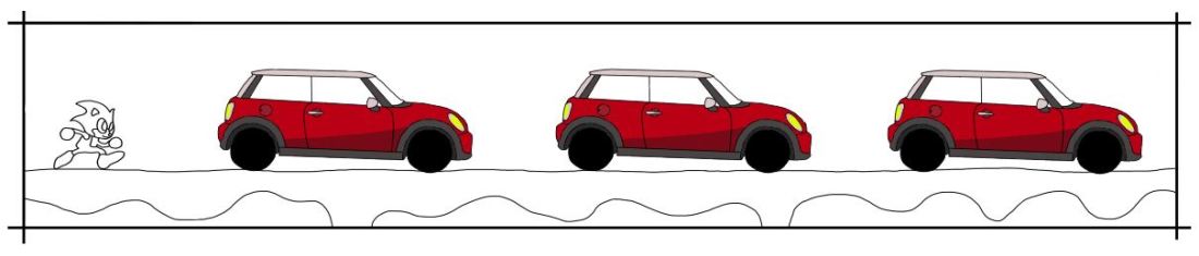
I then copied my Mini Cooper design over and onto my web banner, I did this 3 times so that they would fill up the web banner completely.
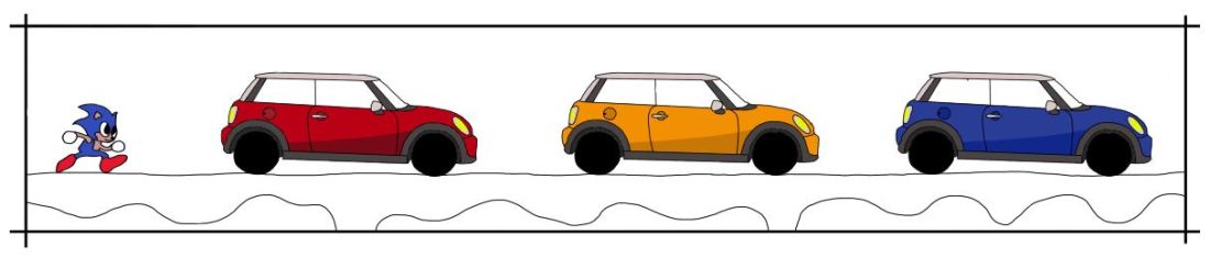
I didn’t want all of the Mini’s to be the same colour because it looks boring and it isn’t very interesting – I did a little research into the different colours of the Mini and the main colours were Red, Yellow and Blue. I also coloured in the Sonic to match the colours from my magazine spread.

In the next image, I added in all the colours for the background. The platform has the some style as it did on the magazine spread, with the lighter bricks. And clouds were added for a little more detail so the sky wasn’t plain.

I then added my Title from my magazine spread to keep this web banner matching. I did the same thing with the shadow effect to make the title stand out more compared to the rest of the design.

We were also given a template for out web banner to go into. I added my design from Photoshop into this image, I didn’t need to resize it as I had drawn my design to fit the area beforehand.
I think that my two designs work really well together and they match accordingly. If you were to seem them in two different places then you would be able to recognise each one and know that they are related which was what I was aiming to do.
