Final Evaluation

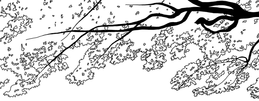
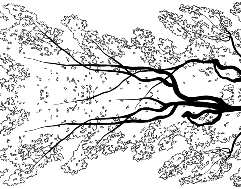
Working on this brief, for me the most interesting part was the ‘Recordings in the style of..’. This was because I was allowed to experiment with a wide range of medias, which is creative and this is what I enjoy. This research had a massive influence on the development of my visual recordings, I chose a few of the graphics designers styles to use for my own work and with these styles I refined them into mock ups of final designs. The styles that had the most influence on my were: Paraschiv and Church. This was because in Paraschiv’s work I liked the idea of a well laid out composition, making the final outcome look professional – in Church’s work I really like the high amount of detail you can add, the simple dots and lines can create shadows and highlights which add a lot to a simple outline of a fruit.

When I was refining my work I was able to include my own photos with the use of the styles from graphic designs, I feel like my refined drawings were successful because they clearly linked with graphics designers work and they were at a high level of drawing compared to my ‘Recording in the style of..’. Out of all my visual recordings a feel like there were a few failures, these came from drawings which were in the style of Greaves and Beetson. This is because I thought that my drawings weren’t as good as my others as they weren’t to a high professional standard, I chose not to carry these visual recordings forward into my ‘Refined Drawings’ as they would’ve been hard to develop.

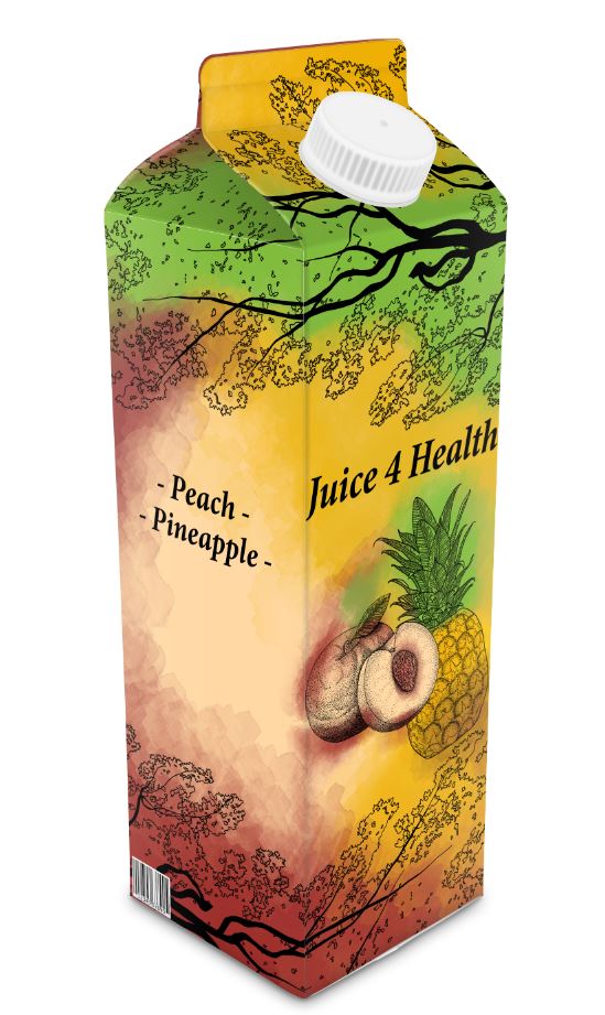
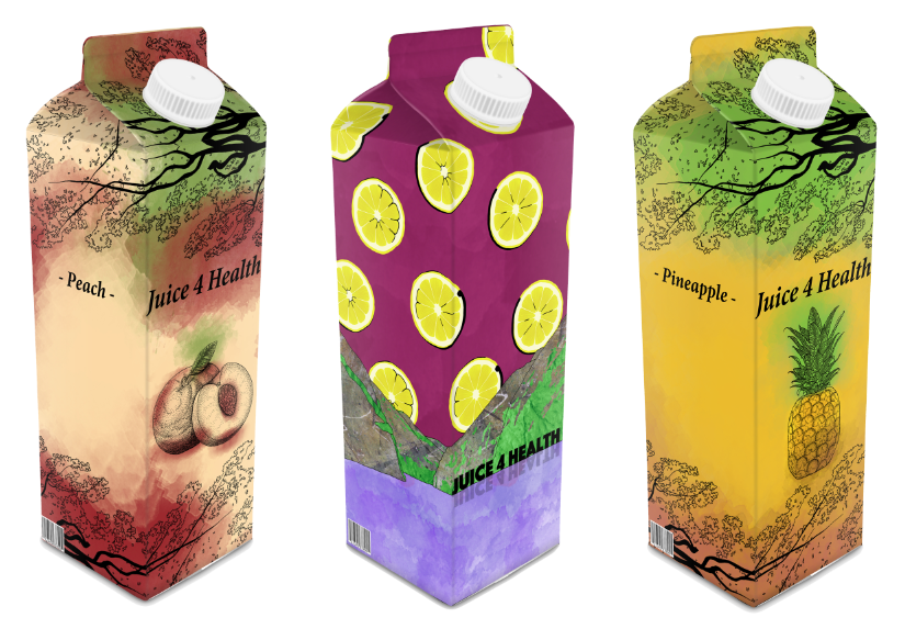
I felt like the two designs I chose to carry on forward where the correct two because I felt comfortable with my designs and how they looked, I was happy with my refined drawings of them and they were fun to develop into better ideas. I think that my own sources helped with my choices for the family bases fruit juice packaging, as the leaves on the top and bottom relate closely to the outdoors which could resemble a happy, family day out. For the gym goers packaging I drew everything myself and didn’t use my own sources, I would’ve liked to use photos from a gym or a sporting activity however I wasn’t able to collect these images for myself.

I feel like the final styles I used fit well with the target audiences of Families and Gym Goers, my family style is probably a little more sophisticated than I would have like as children are involved in the family seen, however the colours I used make the design stand out and the style adds great detail to my design. For gym goers, I feel like the style used works perfectly as it is bold and makes the fruit stand out – which is important as it is a fruit juice packaging, the colours also help make the packaging stand out with a large amount of bright yellows and reds being used.

I feel like my final designs are completed to a high standard and I personally think it would be difficult for me to improve on these two designs, I don’t think there any failures in these designs as I have removed many of these mistakes during the refinement process. From this project I have learnt that my drawings with the computer can be very strong, so for future assessments I feel like using digital drawings will help me achieve the standard I would like.


Refined Juice4Health Gym Goers Carton

For the first stage of my design  I needed to choose a suitable background and fruit to use – as well as it clearly linking to sporty people.  I used the fruits and background from my ‘Refined Drawings’ as I thought that these were well drawn and would work well in my final design. To clearly link my design to Gym Goers I had drawn a kettle bell and dumb bell – both are pieces of equipment that can be seen in a gym. I think that the background is a suitable colour as none of the fruits are purple/pink, I like the water colour effect that has been added on top of the solid purple background as it gives it more detail – the solid background looked dull. The watercolour effect was added by a free brush of the internet, I made it a little pinker so the solid background looked a little more appealing. From my ‘Refined Drawings’ I kept the Spout and Gable the same, as I really liked how it looked on the final packaging. I started off with 1 kiwi and copied and pasted it several times all across the page – having them overlap with one another. I then did the same with the lemon slice and made all them a layer below the kiwi so that they were on top.

This second stage is where I changed my design a fair amount from my ‘Refined Drawing’, I really  liked how I made the Spout and Gable in the first stage I decided to carry it on for the Front/Side – making the fruit seem to slowly fall down the cartoon. As I wanted to have the name of the company ‘Fruit4health’ on the Front side of the carton I decided to leave this side till last – the blue line shows which side is what, the left being Side carton and right being Front carton. In the first image it shows the cherries being added, the second image shows the apples being added, the third image shows the lemon slices being added and finally the fourth image shows the kiwi being added. I think that this layout is much better than my previous design as it is more immersive and looks more professional – you can also clearly see what the individual fruits are. This was all done with the same method previously explained, copied and pasted fruit.

The next step was to make the fruits on the Side of the carton look more natural, previously they had a distinctive separation between the fruits. I added more kiwi over the top of the lemon/kiwi to blend them together better, added more lemon over the top of the apple/lemon to blend them together and added more cherries over the top of the apple/cherry. Now just focusing on the Front cover of the carton, as you can see there is a small bit of fruit coming across from the Side cover – I copied this small part over to the other side so that it became symmetrical, making a clear middle of the name of the company. I started to ad the gym equipment to my design, I chose not to use the kettle bells as there was too much yellow already on the page – coming from the lemon slices, I also feel like if these were in the final design then it my have made it too confusing with all the different things going on. I decided to just add the dumb bells around the edge of the fruit, changing the sizes and rotation of them to make it look more abstract. I personally think that this works well and help to show that this Fruit Juice Packaging is aimed at Gym Goers.


The name of the company was added to the middle of the of the Front cover, I chose to place it here as the text can be fairly large and still fit all in the Front cover. The font used also helps with making the name look bold, as the lines are thick. I like this as it stands out well and can relate to Gym Goers as a sporty advertisement can be aggressive and bold. I also added the flavour of the fruit to the Gable as this is right at the top. A barcode was added to the bottom-left of the design as these are fairly important when buying a product. I haven’t included other important information such as nutritional information as there are 2 other sides to this design which you can not see, this information can be added onto the back – keeping the Side and Front looking clean and professional.

The final image was made by running a program to transform my Flat Refined Drawing into a Final Piece.

Refined Juice4Health Family Carton

The first stage in my design was to add branches to surround the fruit. I copied and pasted these branches from my ‘Refined Drawings’ as I thought they were a key feature in my packaging. I had drawn them in Photoshop from an ‘Additional Photo’ which was taken by myself in Norway. The leaves were outlined in one line with a thin black brush, the gaps inside the leaves were where there were holes in the photos – making it look more realistic. The branch is a solid black colour and follow the direction of the leaves, I made it a solid colour to make it stand out and add more detail. I copied the bottom tree to the top to make it symmetrical – this would cover the Side/Front of the packaging, I also copied another tree drawing above the top Front Side so that it would fill the Spout and Gable. As you can see in the first image, the branches don’t look normal and this isn’t the look I was going for in my final design. So I erased a part of the branch and then re-drew it so that it flowed better around the page and didn’t look identical to the one just below.

The next stage was to add the fruits into my design, I used the Peach from my ‘Refined Drawing 2’ and the Pineapple from my ‘Refined Drawing 3’. The blue line in the middle of the page shows which side the Front and Side would be – on the left will be the Side and on the right will be the Front of the packaging. I wanted both fruits to be on the front of the packaging so that it is easy to see and you don’t have to turn the packaging around to see the images. I tried a few compositions with the two fruits, I liked the 3 image the best however as you can see the Pineapple overlaps the Peach. I erased the Pineapple so the Peach looked like it was at the front, I did this as I think the Peach has more detail and is a little smaller than the Pineapple.

The next stage was to add colour to my packaging. This design is inspired by Caroline Church and in her work she doesn’t use any colour – as I said in my evaluation of her work I think that I could improve it by adding a little colour to help show what the fruit are even more. The first image is the background from my ‘Refined Drawing 2’ which is of the Peach – the red and peach colour help to show off the actual drawing of the Peach well. The second image is the background from my ‘Refined Drawing 3’ which is of the Pineapple – the yellow and green also help to show off the actual drawing of the Pineapple. As I was including both fruits into my final design it would’ve looked a little bit odd if I included just one of the previously mentioned backgrounds, this would’ve been because the peach background wouldn’t have matched the Pineapple and the pineapple background wouldn’t have matched the Peach – so I needed to try and incorporate the colours from each piece and try to create and exciting background. The third image is my final design for the background, I think that this works well as you can still clearly see which colours match what fruit, I did this by splitting the two backgrounds diagonally from top-left to bottom-right and then blended the two together with slight overlapping colours to make the edges less sharp.

I then added the black and white drawing of the trees and fruit over the top of the background, I am happy with this look as the colours still match the fruits well and it isn’t too confusing – the plain peach colour on the left-hand side is good because this is where I can add important information about the fruit, such as what’s in it.

The name of the company was added above the fruits and below the trees so that is most or less centred, I also added text on the left-hand side to show what is inside the Fruit Juice. I used this type of text because it suites the rest of my design, the typography is sophisticated and so is Caroline Church’s work. A barcode was added to the bottom-left of the design as these are fairly important when buying a product. I haven’t included other important information such as nutritional information as there are 2 other sides to this design which you can not see, this information can be added onto the back – keeping the Side and Front looking clean and professional.

The final image was made by running a program to transform my Flat Refined Drawing into a Final Piece.

How Kate Molloy Presents her work

Kate Molloy is a graphic designer whom owns a company called ‘Little Designs Cambridge’, she has owned this company for 5 years and is a professional in her work. She works with illustration, logo design, typography and digital design.

She show’s her work to her clients through a presentation, with clearly understanding of what her ideas are with a well done layout. At the end of each presentation she shows what her work would look like in a mock up situation e.g. a social media platform like Facebook.

This is what Kate’s presentations look like, shown above. As you can seen the ideas she uses are very clearly shown – ordered. She keeps a few things the same throughout each page, this being the name of her company, design 1..2.., and a small piece of information about each piece (which is offset by a pale colour).

Kate’s client is ‘Planet Grief’, she keeps the name of the company and a related image in every drawing. Planet Grief is a website which let’s you posts articles about what you grieve, whether that is a lost one etc.


Above are Kate’s layouts for her initial designs, as you can see she has carried this layout throughout all of her work – initial to developed ideas. Her initial ideas are shown clearly in the centre of each page, the negative space around it makes the image very clear – the black pencil also stands out against the white background which helps as well. She doesn’t write much about each piece, this keeps it simple so the client doesn’t get too bored too quickly as they only really want to see her ideas. The information Kate provides is only about the meaning behind each image, the ballon in the first image and the two planets in the third.

In her developed ideas she shows 3 different backgrounds with the same logo and title, this is a good way for the client to see which one they prefer the most as it is very clear to see. I think I could use this layout for my own visual recordings as it would be good to experiment with different background and keeping the same fruit. Or even, keeping the same background and changing the fruits – this could be a good way of seeing the different flavours of fruits that the packaging sells.