
Below are some app icons that I liked, the use of foods taking up the whole app layout is successful in my opinion.


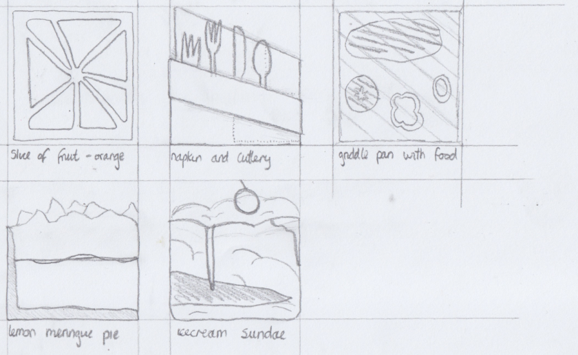
These are some rough experiments for an app icon, I personally like the ice-cream sundae the best as this could relate to the ‘crazy’ style from the brief.
Below is some research into ice-cream sundaes as this will give me an idea of what my app icon should look like.


