Final Evaluation

When I first saw the brief I thought that it was going to be a fun assessment because it entirely involved using the computer to create designs, which I found a lot easier and more interesting than hand-made products. The part of the brief that I enjoyed working the most on was the instructional illustration, this was because it included a lot of smaller drawings which I could show off my skill.

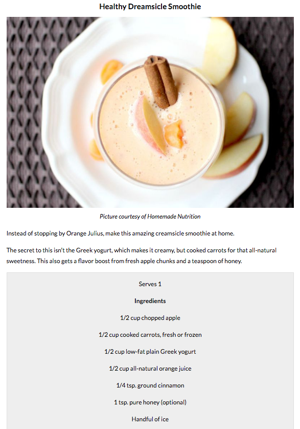
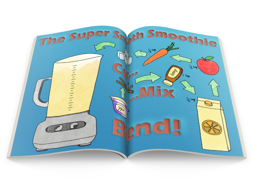
When I was researching for this brief, the most successful thing that inspired me in my illustrations were the layout of each piece. I learnt that the layout is important because this is what tells the story of your design – for my instructional illustration it needed to follow a step-by-step guide on how to make that smoothie, the use of arrows helped the audience follow with ease – for my app a lot of my research for food related apps had completely filled the space, I tried to achieve this in my on work.

For this brief, I found it difficult to include a ‘crazy’ aspect into each of the designs, some of my designs might not be as crazy as i’d like therefore making them slightly unsuccessful.

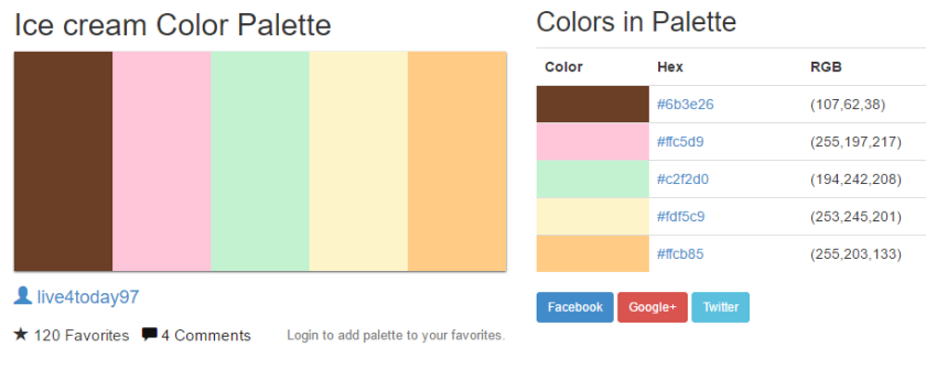
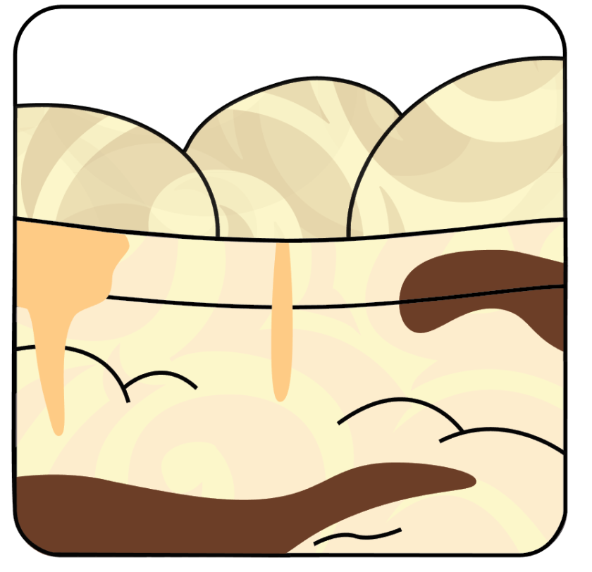
For my app icon, I think the way I have used ice-cream colours and the patterns involved in my design has made it successful – the browns and cream look like chocolate and vanilla which is relatable to a real-life food and the Graphic Style with the swirls make my overall design look interesting and unique. I think that these swirls make my ice-cream look a little bit crazy therefore meeting the brief, however it is all a similar colour so it isn’t as eye-catching as i’d hope. If I was to improve on my app icon I would mess around with the colours to make it more eye-catching and try to make it fill the layout of an app completely as in my research this is what I found successful. To make it fit the brief even more I could’ve added food on top of the ice-cream, something like a cherry or a chocolate flake – a cherry would add a different colour which would make the overall design a little more successful.

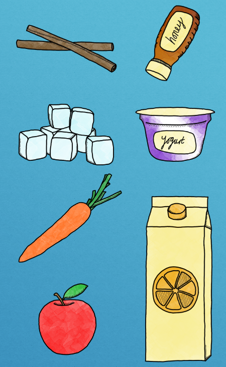
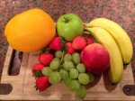
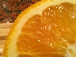
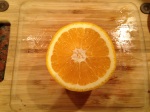
For my instruction illustration, I think that my smaller illustrations are successful because they are all the same style, clear to see what each of them are, and the arrows help to guide the audience around the recipe with ease. The text was one of the longer designs to create, as it involved a lot of effects to multiple different things, I think that the paper-cut out effect is effective and looks a lot better than what normal text would look like – it adds a personal style which isn’t seen in any other design. I am very happy with the finished quality of my instruction illustration as it looks clean and professional, I think that it meets the brief of being a ‘crazy’ recipe as some of the ingredients used in this smoothie are not very common e.g. carrot.  To improve on my design, I think I could add a lot more detail into the individual designs, make them look a lot more realistic and not just an outline with water colours – although this type of style would aim more towards kids as it is fun and exciting.

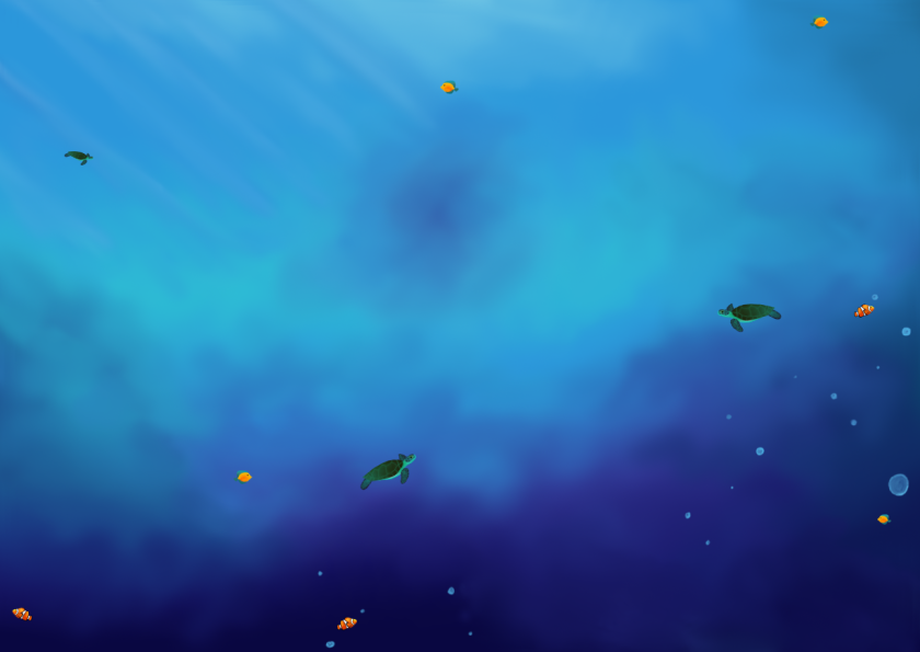
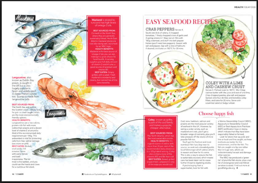
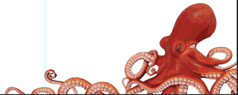
For my magazine spread, I am very happy with the final outcome and the quality of my work. I think that the designs for the octopus and prawns are successful in the way that they look very realistic and impressive however unsuccessful in the way that it didn’t involve much skill to do as it was just a program in Illustrator and didn’t involve me drawing it by hand. I think my background is a successful design as this was entirely made by hand and I am happy with the way the colours are blended together and all the smaller fish add details which are impressive. If I was to improve on my design I would draw the octopus and prawns by myself to the same professional scale the computer program did – I used Illustrator as it was a different computer software and it didn’t take much time, this project was very short on time and I thought this was the best way for me to complete my work. I think that this piece fulfills the brief as seafood can be seen as a ‘crazy’ food, especially octopus – which is why this design has taken up a lot of the spread and is one of the first things you see.

Throughout this project, I found using Photoshop a lot easy than Illustrator. As with Photoshop I had had a lot of practise at home and last year so I felt very comfortable with it. When using Illustrator, I had to watch a couple of Youtube videos to get the basic skills on how to draw lines etc. this made it difficult for me as I didn’t really know what I was doing and I felt a lot more uncomfortable.

As a whole, I have learnt new skills when it comes to using computer softwares like Illustrator and even Photoshop. My research helped me a lot to find out what works well with each design and how I should incorporate the successful designs into my own.

Magazine Spread Development

My magazine spread will be related to seafood so some animals that I plan on using will be octopus, prawns, turtles and other smaller fish – as these are not common foods it can be classed as crazy.

I plan on having the octopus at the bottom corner of the magazine and have the tentacles spread across the bottom onto the other page. To create the added tentacles I have used the Lasso Tool which allows you to select certain areas. holding down Shift while selecting areas allows me to select more than 1 at a time.

With the extra tentacles selected I pressed Cmd+Shift+I to inverse the selection and then Delete to erase everything apart from the tentacles. Doing this means that I have have the same image as the octopus therefor the colours and texture is the exact same and it doesn’t look edited – realistic. I then arranged the new tentacles along the bottom side of the magazine so that the octopus seems spread out and large.

I then went into Illustrator with the octopus image to use an effect called Image Trace, this allows you to change the colours of the original image and some effects have a greater change than others. For my design I used the effect of 16 colours which is where the computer program colours the image with 16 similar colours as to the original – this is a very quick way to get a painted look, however there isn’t much involved in doing so. I think that using this tool is successful as it is very realistic to the image however it does lack skill as Illustrator does it all for you.

Capture 7

I then pasted the Illustrator illustration back into Photoshop to carry on with the design, moving it back over where the first image of the octopus was. The blue solid line shows me where the middle of the magazine spread is – as this is a double page it is useful to know what designs cross over onto the other page. I wanted the octopus design to cross over as this will make it look like it takes up more of the overall page.

I then did the exact same process with the prawn, putting an image into Illustrator and using the Image Trace Tool with 16 colours, I think that this design looks more painted as the octopus and looks less realistic.

I pasted the design into Photoshop to carry on with my magazine spread, as the octopus is on the right-hand side of the spread I need an image on the left, the blue line shows the middle of the pages. I Alt+Click’ed and dragged on the prawn to duplicate it, I have layered with prawns over the top of one another in an order of 3 – I think that using 3 prawns is more successful than 1 because orders of 3 are more appealing to the eye than just a single image.

As my magazine spread is to do with seafood and sea creatures I thought it would be a good idea to add a blue background to resemble the sea – links everything together nicely. In the second image a used a white brush to paint text boxes where the black text from the interview can be placed, I think that this was a good idea because having text and a coloured background can most of the time be hard to read. These boxes are also creative as they aren’t regular shapes and sort of look like clouds. Because I have used Illustrator to design my 2 images and they way I did it wasn’t very skillful I need to think of a way that I can show off my painting skills – as the background is just a plain blue and I want it to resemble the ocean I plan on creating a lot more detail within the background,  different colours and maybe some smaller sea creatures. I think that adding more detail into the background will make the 2 designs look even better and it will give a proper meaning to the magazine spread rather than block colours.

Capture 15I have started off the background by hiding all of the other layers so that I can focus better on the design, I then added a mixture of block colours just with the Brush Tool so that I could get a rough idea of what I want my underwater ocean to look like. I have included darker blues at the bottom and lighter blues at the top as in a real life situation an image of the sea is darker at the bottom and lighter at the top – because the sun shines on the top first. I think that using block colours is a good way for deciding where you want a light source to come from – in this case the top-left.

Capture 16

I then used a tool in Photoshop called Mixer Brush Tool which is under the Brush Tool, as the name suggests it mixes colours together – so as you can see in the bottom left corner the two shades of blue have been mixed together completely compared to the other shades of colours in this image. I am going to use this Tool to help me shade all the solid colours together and hopefully it will look a lot more like an underwater atmosphere.

Capture 17

This is the finished mixed background using the Mixer Tool Brush. I really like the way this has turned out and it is a massive improvement of my original background – however I feel like it can still be improved with more colour mixing as some of the darker shades and lighter shades don’t mix too well together and there is still a distinctive line separating the two. I still need to add the smaller sea creatures as I mentioned before.

I have added more solid colours to the previous background so I can mix the colours together well – as you can see I have also added a few light blue lines to the top left to resemble the way the light goes through the water, when this is blended together with the background it should create a subtle detail which will work well. I have added a darker spot in the middle of the design as the sea isn’t completely perfect and some parts can be darker than other, this spot helps to make it look more realistic. The 4th image shows all the solid colours blended together and it is a lot more gradual compared to the one above which I like a lot – I think that the darker spot and lighter lines is successful as I fell they add detail which makes it look a lot more realistic.

Capture 22

I have shown the octopus in my design now so that I can see where I should be putting air bubbles, this is just a small detail that should be added as it makes my design a lot more interesting and it adds to something to look at. They were easy to make with with a simple brush and changes the colours of blue within the lighter tone.

As my background is now finished, I need to start working on the smaller sea creatures. I looked up some fish on google to gain inspiration for these animals – I drew these 3 animals with a normal brush and then blended a couple of the harsher lines together with the Mixer Brush Tool. I think that these designs are simple yet really effective – as the fish contain a lot of detail when there are a few on the page it will be interesting to look at other than the octopus and prawns.

Capture 29

Comparing this background design with my very first original one I think that it is a massive improvement, I have now added all the smaller sea creatures within the design and duplicated them so that they could fill up the page. The use of blended colours and highlights adds a lot of detail and will keep the audience interested, it resembles very closely to an underwater image which is what I was going for therefore I think this drawing is very successful and shows a lot of skill in what I can do.

I then put back the prawns, octopus and white boxes to show my finished magazine spread, looking at this design I thought that it was way too crowded and a lot of the work that went into the background has been covered by the white boxes – making it not look as impressive. In the 2nd image I rearranged the boxes and removed some so that more of the background could be seen and it didn’t look too busy, because when making a magazine spread you don’t want the page to be full of text as the reader would quickly look at it and skip over as it would be too much to read. I think that removing the boxes was a successful thing to do because of the reasons mentioned above.

Capture 32

This is my final magazine spread, with text added within the boxes to show what it would look like – I have used a Latin piece as when Graphic Designers design work for customers which want their own text involved (e.g. an interview) you need to put in a filler piece of information so you know that it all works together well.

Instructional Illustration Development


Recipe

For my Instructional Illustration I plan on making a smoothie recipe – I have chosen this smoothie as some of the ingredients seem to be weird in a drink which would make it crazy e.g. carrot. A smoothie recipe will be good to make because they can be detailed and still really easy to follow as all you really do is put all the ingredients in a blender.


I have started to draw all of the equipment and ingredients that will be used in this illustration (the ingredients will be shown later on). I have taken inspiration from one of the outlined illustrations from my research as I think that it is a simple yet effective way of giving information to the audience – they instantly know what the image is meant to be. Later on I will be filling the outlines with shading which will involve thatching or cross-thatching and then colour. The colour will be drawn with a Watercolour Brush as I like the design from one of my researched tasks. The outlined drawing is made from a solid black colour and a brush size of 5 – I copied and pasted the measuring lines so that the were the exact same which makes it look more uniform and professional.

the illustrations shown above are off the shading being added, I have used a much smaller line with a brush size of 2 because I didn’t want it to be as dominant as the outlined drawing – this is only meant to be in the illustration to add detail and show off depth. I have add shading on parts where I believe there may be shadows, to out more emphasis on the buttons and parts of the handle and feet of the blender.


Above are all the illustrations of the ingredients I will be using for the smoothie recipe – in order as mentioned above. I used the exact same brush as I have for the blender so that everything is uniform and doesn’t look out of place – I think just by looking at some of these you can instantly tell what they are e.g. Apple, Carrot, Orange Juice, Ice Cubes due to the shape. However, the others would take a little longer to know what they are so adding shading and colour to these will help improve communication a lot.


I then shaded all the ingredients the exact same way as I did for the blender, shading areas to show depth or curvature e.g. yogurt tub, ice cubes. I think that adding the thatching is successful because if it wasn’t there then the design would be flat and boring, this makes it more interesting which is a positive for the audience.

I have now started to add the colour, with this I have used a Watercolour Brush as I really like the texture that it gives and it makes it look unique. I painted the red colour over the Apple and then erased the colour that went outside the line using the Eraser Tool, if another colour was needed then I would create another layer and then draw with the new colour – for example, the green leaf was drawn on another layer so that when I erased the colours outside the lines it didn’t rub out the red. Once the right bits have been erased I then merged the layer together so that they all became 1 and it becomes a lot more manageable. I have continued this method with every single piece of ingredient, painting, erasing, new layer, painting, erasing, merging. The rest of the ingredients are shown below.


Colour stages for the Carrot.

Colour stages for the Yogurt.


Colour stages for the Orange Juice.

Colour stages for the Cinnamon.

Colour stages for the Honey.

Colour stages for the Ice Cubes.

Capture 92

Colour stages for the Blender.

Below are the exact same steps as mentioned above, in the exact same order. This time instead of creating a title I have made instructions which are very straight forward so they aren’t confusing and easy to follow. I have used the words Cut, Mix and Blend as these are the only steps needed to make a smoothie, I have used the exact same steps as the title as I really like the paper cut out effect and I think it shows a lot of skill.

With all the arrows drawn I have decided to experiment with the different colours, to see which one I prefer and works the best – I carried on the watercolour style within the arrows as well. I made separate red/blue/green arrows as these are common colours and are bright – eye catching, will help the customer a lot to make their eye move from one ingredient to the next.

Capture 113

For the arrow colour I chose to use the colour green, this decision was made because the red arrows were too similar to the colour of the text and the blue arrows were too similar to the background colour. There isn’t much green throughout this design so I thought it was successful and makes the overall design a lot more professional. I have also added the measurements for each ingredient, they are all very similar measurements and I chose to use a hand-written font to make it unique and it fits well with the style of arrows on the page as well.

Screen Shot 2017-05-25 at 13.04.06

This final design was put through a magazine spread action on Photoshop, this action meant that it create a bunch of effects to make my design look like it’s in a magazine – I think that this final product looks successful in this format however it’s difficult to read the middle as the pages are folded inwards.

Instructional Illustrations

Below are some photos that I have taken that I could use within an instructional illustration, with these fruits I could make a smoothie so research into different smoothie recipes would be useful as well.

Below are some images that I gathered from the internet that have inspired me for a instruction illustration relating to smoothies – also some general illustrations relating to cooking.

App Icon Development

Scan

Starting off my App icon I’ve decided to sketch a few different ideas so it’s easy for me to see which one I like the most. Out of these 5 designs I personally like the ice-cream sundae as I feel this could link better to the brief of being a ‘crazy’ app icon. I am then going to scan this onto the computer to then refine into a digital design.

I am using Illustrator to create the App icon as I feel like this piece of Software is the most suitable – for an app icon the design needs to be keep simple and not too confusing as it is small and needs to be easily recognizable, Illustrator’s style creates simple, pleasing lines and shapes, and can be scaled up or down to any size with distortion as it is a vector based program. The image on the left shows the tools that I will use in this design, I copied the outline of my sketch to create simple shapes which I will use as a base-line for my App – I have used the pen tool to do this, by clicking at two points on the page to create a straight line and holding the mouse button down while moving my cursor to create the curves that can be seen.

Capture

I have found a website that people suggest different colours for different designs, I will be using this within my App later on when I start to add colour within. I think that this will be very useful as the 4th colour would be the vanilla base, 1st colour being chocolate sauce and 2nd colour being strawberry – to use these colours in Illustrator I will put in the RGB numbers that given on the right-hand side.

Just looking at the ice-cream scoops, when I drew the lines using the pen tool they have been all separated so when I add colour within the scoops nothing happens – so I need to join all of the lines together so it is one shape then when adding the colours it will work as I want it too. The second image shows the ice-cream scoops in different parts, I will join all of these together.

I have used the Black Arrow Tool to select all three of the ice-cream scoops, by Shift-clicking each one. On Mac, there is a command to join all the lines together, this is Cmd+J, as you can see in the first image all 3 scoops now follow a single path which means they are all together however there is a couple of extra lines that have been added which I don’t want. To get ride of these lines I used the Add Anchor Point Tool and added several points along the line, then using the White Pen Tool and double clicking on the Anchors you can move the line around, I have then moved the Anchors over the top of the curved ice-cream scoop so it looks like they have been erased – I have then done this for the other side as well.

Screen Shot 2017-05-04 at 13.34.16

I’ve done the exact same thing with the bottom of the ice-cream scoop, connecting the sides and bottom together to create a single path line – this time there wasn’t any extra lines added so it worked perfectly.

I then joined the 2 pieces together so the ice-cream scoops became 1 single line, I kept the top bit separate as when I would fill the shape this would then also be filled and that’s not what I want, so I just nudged the line down to make it look joined up by using the Down Arrow Key. I then filled the ice-cream scoop with the vanilla colour that I found on the website (shown above).

I have now done the exact same process as mentioned above for the bottom of the ice-cream sundae, selecting each line then using Cmd+J to join them all together. As you can see on the 3rd image there is another line that I don’t want within my design so I had to make extra Anchor Points to ‘erase’ the line by moving it to the side. I then filled the bottom with the same colour as the scoops to keep it consistent.

Capture 5

I’ve put the top and bottom pieces of my App back together by nudging them towards each other, at the moment this looks plain as it’s all 1 colour – I still need to add the chocolate sauce that I have drawn in my original sketch. I have added some curves to the bottom of the App to make it look more realistic because the ice-cream wouldn’t be flat.

Capture 6

On Illustrator I found a section called Graphic Style, this is where there are a few patterns that are pre-downloaded onto Illustrator. Focusing on the ice-cream scoop first, I Alt+Click’ed on the shape to duplicate it – so I could add this style and not ruin my original if I didn’t like the look of it. I used this curly style as it is very similar to ice-cream swirls if there were more than 1 flavour involved – As the pre-downloaded style was blue I looked around to see if I could find the colours so that it can be changed to match my theme, I changed the Fill to match the vanilla ice-cream and I think that the brown swirls look a lot like chocolate therefore is successful.

I then changed the Opacity down to 15% and moved it over the top of the original ice-cream scoop so it gave a faint effect which I think works well. It’s not too powerful and you can still tell that it has the swirly pattern. I am now going to do the same with the bottom half so that the App will flow well.

Capture 11

I did the same as before and Alt+Click’ed the bottom half to duplicate it – then adding the Graphic Style to this new shape, as you can see the style didn’t work completely and if I carry on to change the colour then there will be bits missing.

I decided to trace around the swirly pattern using the Pen Tool and guessing as to where the lines would be on the missing parts. Doing this now means that I can change the colour of the actual pattern instead of the background – e.g. I could have the swirls be pink to show the they are strawberry instead of brown like the top ice-cream scoops. I then deleted the Graphic Style to just leave me with the traced object.

I have now filled the shape with the colour pink that I got off the website and changed the Opacity down to 15% as well, moving the duplicated layer over the top of the bottom of the App to the same place as the original design.

I have hid the strawberry swirl layer so that it is easier for me to focus on drawing the sauces that would be within the Sundae. I used the Pen Tool again to draw the shapes and then filled them with the colours off the website, I decided to fill 2 of the shapes brown and 2 of the shapes orange so that it is mixed up a little and the orange sauce looks a lot like toffee. Capture 18

Combing all of the layers together I have finished my App Icon and I think that this is a successful design when it comes to meeting the brief for a crazy chef.