
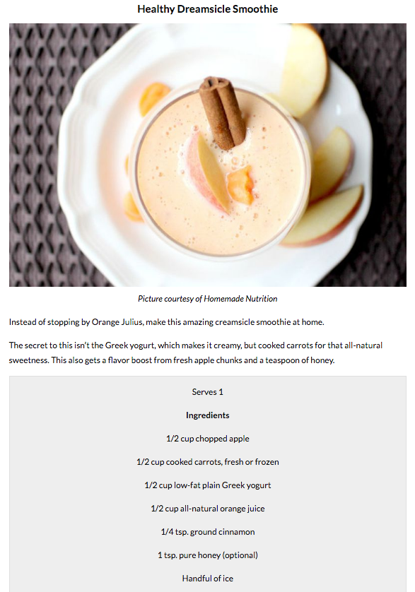
For my Instructional Illustration I plan on making a smoothie recipe – I have chosen this smoothie as some of the ingredients seem to be weird in a drink which would make it crazy e.g. carrot. A smoothie recipe will be good to make because they can be detailed and still really easy to follow as all you really do is put all the ingredients in a blender.


I have started to draw all of the equipment and ingredients that will be used in this illustration (the ingredients will be shown later on). I have taken inspiration from one of the outlined illustrations from my research as I think that it is a simple yet effective way of giving information to the audience – they instantly know what the image is meant to be. Later on I will be filling the outlines with shading which will involve thatching or cross-thatching and then colour. The colour will be drawn with a Watercolour Brush as I like the design from one of my researched tasks. The outlined drawing is made from a solid black colour and a brush size of 5 – I copied and pasted the measuring lines so that the were the exact same which makes it look more uniform and professional.


the illustrations shown above are off the shading being added, I have used a much smaller line with a brush size of 2 because I didn’t want it to be as dominant as the outlined drawing – this is only meant to be in the illustration to add detail and show off depth. I have add shading on parts where I believe there may be shadows, to out more emphasis on the buttons and parts of the handle and feet of the blender.


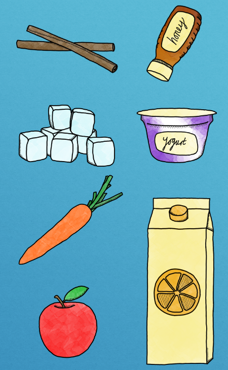
Above are all the illustrations of the ingredients I will be using for the smoothie recipe – in order as mentioned above. I used the exact same brush as I have for the blender so that everything is uniform and doesn’t look out of place – I think just by looking at some of these you can instantly tell what they are e.g. Apple, Carrot, Orange Juice, Ice Cubes due to the shape. However, the others would take a little longer to know what they are so adding shading and colour to these will help improve communication a lot.


I then shaded all the ingredients the exact same way as I did for the blender, shading areas to show depth or curvature e.g. yogurt tub, ice cubes. I think that adding the thatching is successful because if it wasn’t there then the design would be flat and boring, this makes it more interesting which is a positive for the audience.


I have now started to add the colour, with this I have used a Watercolour Brush as I really like the texture that it gives and it makes it look unique. I painted the red colour over the Apple and then erased the colour that went outside the line using the Eraser Tool, if another colour was needed then I would create another layer and then draw with the new colour – for example, the green leaf was drawn on another layer so that when I erased the colours outside the lines it didn’t rub out the red. Once the right bits have been erased I then merged the layer together so that they all became 1 and it becomes a lot more manageable. I have continued this method with every single piece of ingredient, painting, erasing, new layer, painting, erasing, merging. The rest of the ingredients are shown below.


Colour stages for the Carrot.


Colour stages for the Yogurt.


Colour stages for the Orange Juice.


Colour stages for the Cinnamon.


Colour stages for the Honey.


Colour stages for the Ice Cubes.


Colour stages for the Blender.


…
…


…
…


…
…


…
…


…
…


…
…
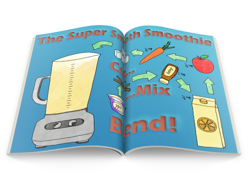
Below are the exact same steps as mentioned above, in the exact same order. This time instead of creating a title I have made instructions which are very straight forward so they aren’t confusing and easy to follow. I have used the words Cut, Mix and Blend as these are the only steps needed to make a smoothie, I have used the exact same steps as the title as I really like the paper cut out effect and I think it shows a lot of skill.


…
…


With all the arrows drawn I have decided to experiment with the different colours, to see which one I prefer and works the best – I carried on the watercolour style within the arrows as well. I made separate red/blue/green arrows as these are common colours and are bright – eye catching, will help the customer a lot to make their eye move from one ingredient to the next.

For the arrow colour I chose to use the colour green, this decision was made because the red arrows were too similar to the colour of the text and the blue arrows were too similar to the background colour. There isn’t much green throughout this design so I thought it was successful and makes the overall design a lot more professional. I have also added the measurements for each ingredient, they are all very similar measurements and I chose to use a hand-written font to make it unique and it fits well with the style of arrows on the page as well.
This final design was put through a magazine spread action on Photoshop, this action meant that it create a bunch of effects to make my design look like it’s in a magazine – I think that this final product looks successful in this format however it’s difficult to read the middle as the pages are folded inwards.
