
My magazine spread will be related to seafood so some animals that I plan on using will be octopus, prawns, turtles and other smaller fish – as these are not common foods it can be classed as crazy.


I plan on having the octopus at the bottom corner of the magazine and have the tentacles spread across the bottom onto the other page. To create the added tentacles I have used the Lasso Tool which allows you to select certain areas. holding down Shift while selecting areas allows me to select more than 1 at a time.


With the extra tentacles selected I pressed Cmd+Shift+I to inverse the selection and then Delete to erase everything apart from the tentacles. Doing this means that I have have the same image as the octopus therefor the colours and texture is the exact same and it doesn’t look edited – realistic. I then arranged the new tentacles along the bottom side of the magazine so that the octopus seems spread out and large.


I then went into Illustrator with the octopus image to use an effect called Image Trace, this allows you to change the colours of the original image and some effects have a greater change than others. For my design I used the effect of 16 colours which is where the computer program colours the image with 16 similar colours as to the original – this is a very quick way to get a painted look, however there isn’t much involved in doing so. I think that using this tool is successful as it is very realistic to the image however it does lack skill as Illustrator does it all for you.
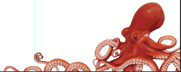
I then pasted the Illustrator illustration back into Photoshop to carry on with the design, moving it back over where the first image of the octopus was. The blue solid line shows me where the middle of the magazine spread is – as this is a double page it is useful to know what designs cross over onto the other page. I wanted the octopus design to cross over as this will make it look like it takes up more of the overall page.


I then did the exact same process with the prawn, putting an image into Illustrator and using the Image Trace Tool with 16 colours, I think that this design looks more painted as the octopus and looks less realistic.


I pasted the design into Photoshop to carry on with my magazine spread, as the octopus is on the right-hand side of the spread I need an image on the left, the blue line shows the middle of the pages. I Alt+Click’ed and dragged on the prawn to duplicate it, I have layered with prawns over the top of one another in an order of 3 – I think that using 3 prawns is more successful than 1 because orders of 3 are more appealing to the eye than just a single image.


As my magazine spread is to do with seafood and sea creatures I thought it would be a good idea to add a blue background to resemble the sea – links everything together nicely. In the second image a used a white brush to paint text boxes where the black text from the interview can be placed, I think that this was a good idea because having text and a coloured background can most of the time be hard to read. These boxes are also creative as they aren’t regular shapes and sort of look like clouds. Because I have used Illustrator to design my 2 images and they way I did it wasn’t very skillful I need to think of a way that I can show off my painting skills – as the background is just a plain blue and I want it to resemble the ocean I plan on creating a lot more detail within the background, different colours and maybe some smaller sea creatures. I think that adding more detail into the background will make the 2 designs look even better and it will give a proper meaning to the magazine spread rather than block colours.
 I have started off the background by hiding all of the other layers so that I can focus better on the design, I then added a mixture of block colours just with the Brush Tool so that I could get a rough idea of what I want my underwater ocean to look like. I have included darker blues at the bottom and lighter blues at the top as in a real life situation an image of the sea is darker at the bottom and lighter at the top – because the sun shines on the top first. I think that using block colours is a good way for deciding where you want a light source to come from – in this case the top-left.

I then used a tool in Photoshop called Mixer Brush Tool which is under the Brush Tool, as the name suggests it mixes colours together – so as you can see in the bottom left corner the two shades of blue have been mixed together completely compared to the other shades of colours in this image. I am going to use this Tool to help me shade all the solid colours together and hopefully it will look a lot more like an underwater atmosphere.

This is the finished mixed background using the Mixer Tool Brush. I really like the way this has turned out and it is a massive improvement of my original background – however I feel like it can still be improved with more colour mixing as some of the darker shades and lighter shades don’t mix too well together and there is still a distinctive line separating the two. I still need to add the smaller sea creatures as I mentioned before.


I have added more solid colours to the previous background so I can mix the colours together well – as you can see I have also added a few light blue lines to the top left to resemble the way the light goes through the water, when this is blended together with the background it should create a subtle detail which will work well. I have added a darker spot in the middle of the design as the sea isn’t completely perfect and some parts can be darker than other, this spot helps to make it look more realistic. The 4th image shows all the solid colours blended together and it is a lot more gradual compared to the one above which I like a lot – I think that the darker spot and lighter lines is successful as I fell they add detail which makes it look a lot more realistic.

I have shown the octopus in my design now so that I can see where I should be putting air bubbles, this is just a small detail that should be added as it makes my design a lot more interesting and it adds to something to look at. They were easy to make with with a simple brush and changes the colours of blue within the lighter tone.


As my background is now finished, I need to start working on the smaller sea creatures. I looked up some fish on google to gain inspiration for these animals – I drew these 3 animals with a normal brush and then blended a couple of the harsher lines together with the Mixer Brush Tool. I think that these designs are simple yet really effective – as the fish contain a lot of detail when there are a few on the page it will be interesting to look at other than the octopus and prawns.
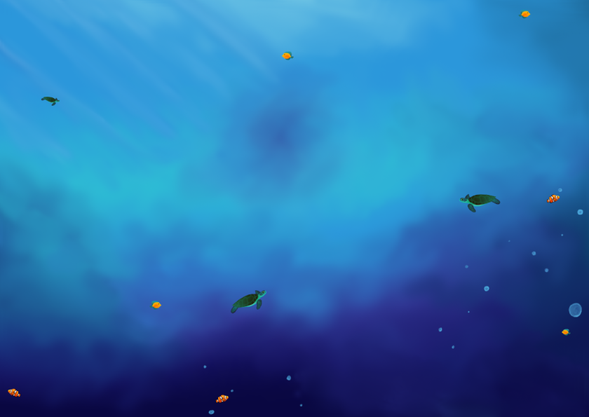
Comparing this background design with my very first original one I think that it is a massive improvement, I have now added all the smaller sea creatures within the design and duplicated them so that they could fill up the page. The use of blended colours and highlights adds a lot of detail and will keep the audience interested, it resembles very closely to an underwater image which is what I was going for therefore I think this drawing is very successful and shows a lot of skill in what I can do.


I then put back the prawns, octopus and white boxes to show my finished magazine spread, looking at this design I thought that it was way too crowded and a lot of the work that went into the background has been covered by the white boxes – making it not look as impressive. In the 2nd image I rearranged the boxes and removed some so that more of the background could be seen and it didn’t look too busy, because when making a magazine spread you don’t want the page to be full of text as the reader would quickly look at it and skip over as it would be too much to read. I think that removing the boxes was a successful thing to do because of the reasons mentioned above.

This is my final magazine spread, with text added within the boxes to show what it would look like – I have used a Latin piece as when Graphic Designers design work for customers which want their own text involved (e.g. an interview) you need to put in a filler piece of information so you know that it all works together well.
