

Images
Refined Poster for Final Idea
For my Magazine Spread:


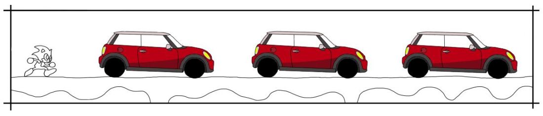
The first step in my design was to draw an outline for the game machine. To draw this I used a thin (4) black brush – in Photoshop you can hold down the ‘shift’ key to get straight lines which help a lot with this project. In the next image I added in buttons to the bottom of the machine, then some boxes for information e.g. Title and Slogans so my audience knew what they were buying. And then the final image is of the outline of the game screen – Sonic the Hedgehog. I outlined an image from the game itself so that my drawing would look familiar to a player of the game.


I then created a new layer and added solid colours to my design. I made the game machine mainly grey and black so that it was obvious what it was but not eye catching so my consumer isn’t distracted. I also matched the colours of the Sonic game so that it kept the familiar feel, I chose to colour the Mini in red as this was the colour that I saw the most when I was doing research into the company. The next image I added in the text, I used a free retro font from the internet which matches my theme perfectly, I changed the colour of the font so that it would stand out against the black / grey game machine. I created the shadow of the text by duplicating the yellow text, then changing the colour to grey, setting the grey layer behind the yellow layer and then moving it to the bottom-right ever so slightly. I think that this works well as it doesn’t make the text seem flat and 2D.


I was happy with the previous images above but I thought that I could’ve added more detail into my design. I chose to add some shadows to the buttons on the game machine an from the feedback i got from the ‘Car enthusiasts’ I also added in a Mini Logo – to help show that this poster is for selling Mini’s. Adding the shadows to the buttons was fairly easy to do, I used the lasso tool in Photoshop to select a small part of my design, and then brushed over that area with a darker shade of colour to make it give a shaded effect, I think that this worked well and looks better than the previous ‘flat’ buttons. In the next image I added in some brick work to the Sonic game, I did this because my previous design was flat was seemed to be a little boring. I think that the random sized bricks look interesting and work well in my design and it makes the whole screen ‘pop’ much more, I did this by selecting a lighter shade of the background and then changing the brush size (15-35)
to get random shaped bricks. I also added the reflection oft he clouds onto the water to make it seem further away from the platform – creating more depth in my design.


I then put my final design into and action that we were given at the start of the brief, this action turned my design into a more realistic magazine spread – by adding highlights, a second page, shadows and curves in the page.
For my Web Banner:
The web banner is similar to my magazine spread and I copied some of my designs over so that my audience knew that these two posters would go together.

Firstly, I drew an outline for the platform on the web banner, I then copied my Sonic outline from my magazine spread so that it would look the same.
I then copied my Mini Cooper design over and onto my web banner, I did this 3 times so that they would fill up the web banner completely.
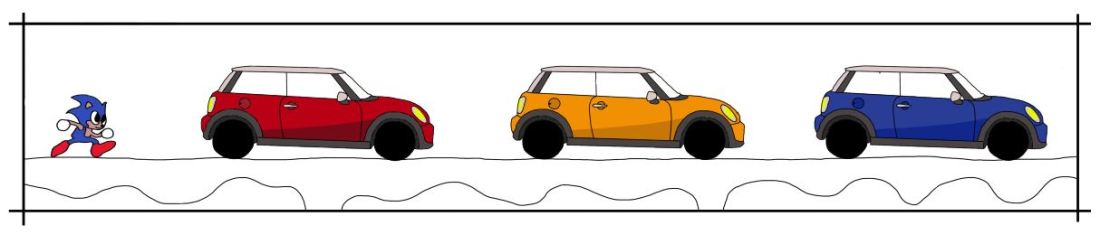
I didn’t want all of the Mini’s to be the same colour because it looks boring and it isn’t very interesting – I did a little research into the different colours of the Mini and the main colours were Red, Yellow and Blue. I also coloured in the Sonic to match the colours from my magazine spread.

In the next image, I added in all the colours for the background. The platform has the some style as it did on the magazine spread, with the lighter bricks. And clouds were added for a little more detail so the sky wasn’t plain.

I then added my Title from my magazine spread to keep this web banner matching. I did the same thing with the shadow effect to make the title stand out more compared to the rest of the design.

We were also given a template for out web banner to go into. I added my design from Photoshop into this image, I didn’t need to resize it as I had drawn my design to fit the area beforehand.
I think that my two designs work really well together and they match accordingly. If you were to seem them in two different places then you would be able to recognise each one and know that they are related which was what I was aiming to do.
Digital Thumbnail Ideas
Idea 1: Nostalgia, SS, Thumbnail Development

My first digital idea comes from the concept of Nostalgia. I feel like Nostalgia is a good way to grab the audience’s attention, because they can remember what it is from their past. My initial idea was to try and sell a ‘first cheap sports car’, therefor the audience would be people of a younger age and the theme would need to be sporty/fast. I linked 2 separate thumbnails from my sketchbook to come up with this digital idea because I thought that they could be linked well together, the game machine indicates that, what the consumer is seeing is retro and Sonic the Hedgehog is a fast well known video game character. I also believe that this design is successful because the colour scheme also matches with retro video game era, there were a lot of bright solid colours, and not much shading/toned art work.
If I was to take this design into further refinement then I would need to experiment with a few things. One of them would be to see if I could make the game machine take up the whole poster – I mentioned this in the ‘Nostalgia Concept Idea’ page in my sketchbook, I think by doing this it would make the poster seem more immersive and the game machine wouldn’t seem stuck in the middle. Another thing I would experiment with would be the text, at the moment I like the font, retro style with yellow and a small shadow, however changing the title to something different may be more appealing to my audience.
Idea 2: Close up, DS P1 P2, Thumbnail Development


My second digital idea comes from the concept of Close Ups, I have made this design into a double spread poster so it covers 2 pages. Out of all of the concepts I have researched I personally like the ‘Close Up’ concept the most. It is also an easy way to come up with ideas because it mainly involves enlarging a part of a car to fill the page. That is what I have done with this digital idea, this is the front grille of a Range Rover and it gives a good immersion as it completely fills both pages of a magazine. This design easily links with car advertisement because you can clearly see that it’s a car with the brand and logo – I believe that this design is a successful design because it is fairly realistic, with further development and shading / highlighting etc I could make it look more like the front of a car. With the concept of ‘Close Ups’ I have learnt a few techniques that have been useful, these involving enlarging / retouching / cropping and distorting.
If I was to refine this idea further then I would do research into slogans and other information that could be added onto the spread, because at the moment the only information on the page is the name of the company – Range Rover. Other information could included specifications of the car, engine size, price speed etc. Also further refinement could include highlights and shading so the edges aren’t as sharp and the colours all fade realistically.
Idea 3: Close Up, WB, Thumbnail Development

The image above is my final design of my thumbnail development. It comes from the concept of ‘Close Ups’, as I said in my previous digital idea, this is one of the concepts I enjoyed the most. For the brief we had to design a magazine spread and a web banner, and for my final design I tried to develop an idea into a web banner. This idea came from my ‘Visual Analogy’ page from my sketchbook and I thought it would be a successful web banner as it is a fairly long poster design – however this could also work as a successful double magazine spread. This design clearly links with the concept of ‘Close Ups’ due to the front of the car, this takes up half of the spread. The idea of this design comes from the fact the car has very bright lights and that it can light up the solar system as it symbolises the sun, the planets then follow to help develop this idea.
Out of all three of the designs I personally like this one the least, this is probably because it is the least developed out of the 3. If I was to develop this design further then I would definitely add more text to the design. The text would most likely say something along the lines of ” What’s the brightest thing in our solar system?”. Also, although the car is a photo taken by me I would probably draw it out myself in Photoshop so it would match the rest of the design, also drawing out the rest of the planets and shading / highlighting would help to refine this design.
Eye tones

Silhuoetting

Human and Animal face combined illustration

I created this illustration by starting off with drawing half of my face traditionally with black and white tones, also I got a picture of a dog and digitally drew the other half of the face with black and white brushes. I then used Photoshop and put both drawings next to one another, I made the background all the same colour by using the clone tool. I used mostly the dogs’ features like the shape of his face because my traditional drawing wasn’t complete and I only drew the top half (no mouth). So I copied some of the main features from my traditional drawing and laid them over the top of the dog i.e. hair, ear and eyebrow. I used a filter in Photoshop to create the colour of the dog, there are 2 different colours, light and dark brown. The lines in the background are created by repeated rectangles, but different lengths.
The lines for the background were influenced by a designer we were shown in class. I can’t remember their name but I liked the way that the design is simple but it makes the main image stand out.
There are a couple of things that I think are successful in my illustration. For example, I think that the eyes are toned well with a good lend from white to black, same with the nose. I like the shape of both human and dog ears, the black brush defines the ears and ads shadows. I think that the colour of the illustration is successful because it matches the true colour of the dog which makes it look more realistic compared to a black and white drawing. The lines in the background were successful because I think that it makes the illustration stand out better and it helps the eye to look around the page.
There are also a few failures in this illustration. I think that the tone drawing for the dog doesn’t work well because it doesn’t really fit the rest of the design, the white strip down the middle doesn’t suite the digital drawing and the tones are not very good. One side is darker than the other and the black and white doesn’t blend well together. Also, I don’t like the traditional drawing of my hair overlaid on top of the dog. I drew over the hair with a black brush, I dislike this part of my illustration because it doesn’t look realistic and I could’ve drawn it better if I had taken my time. I think that if I took more time with my digital toning then the dogs face would have looked a lot better.
This illustration meets the brief because the brief was to combine a drawing of a human and animal. This was met when I incorporated some of my faces features alongside the dogs face. If I was to do this again I would probably change my animal drawing, this is because this dogs face is really long and it doesn’t show a mouth. This made it difficult to combine my face with the dogs because compared to the dogs mine is shorter. Next time if I was to choose an animal it would be one with a more rounded face.
Tone drawing

Ticket Design

This ticket was made on a designing program called Indesign. I then downloaded a ticket temple off the Long Road moodle and then added in all of my festival information. In this program you have to create boxes and then you can place images and text inside them. To start of with it was a little bit difficult to get use to because it is different in Photoshop and Illustrator. The same as my posters, I have made a black background so my logo doesn’t look out of place. The important information on the ticket is the largest text and then the lesser important are the smaller pieces of text, this is so that when people read the ticket they read the more important information because it is the biggest and then after they read the smaller parts. On the ticket there is everything that is needed: Festival name, Acts that appear at the festival, date, time, location and your ticket number.
Poster inspired by Games

Final logo design

I came up with this design from making my own logo design process, this was just were I drew a load of different ideas that I thought could be a good final design. I then scanned this onto the computer to edit in Photoshop and Illustrator. In Photoshop I deleted the background and then added a gradient in Illustrator, the gradient is made up with the 4 colours from my festival visual identity sheet. I made the yellow on the left-hand side because it is the most related to light, I then added a flare over the filament of the bulb so it looks like it’s glowing. Also, in Illustrator I changed the image from a raster into a vector, this is so that if the image every needs to be blown up (e.g. poser on the side of a building) then it won’t be pixelated and it would stay smooth.
When making the logo I decided to add a light bulb as an image because it suites the name of the festival, also the glow from the flare relates to the name “Illuminate” as well.
I chose the colours: yellow, orange, green and blue because they are all pop festival colours, they are also bright and lively which makes you feel happy when you see them.
I think that the logo conveys a bright and lively mood, this is because of the use in colour and the flare glows, making everything bright.
I think that the software that I used was very suitable because it was very easy and simple. For example, when I was experimenting with colours it was very easy to change them quickly and easy to edit.
When making this I think my weaknesses were that it took a couple of lessons to learn how to use Illustrator but after that everything was fine.
