1. Using and sitting at a computer:
Month: October 2015
Homework 4: Designer Research
 This poster is from Dan Stiles, the colours that he has used in this poster are very simple and stand out well. The purple and yellow are contrasting so they are bright against each other, yet the yellow and red are harmonious so they go well together. The black and white background is good because it separates the poster, goes well with the image used and makes the yellow text stand out. The poster is laid out well because the main focus point (the two faces) are in the middle of the page. The text is put at the bottom of the page, underneath the image. He has scaled the text well because he has made the important text the largest “Edward Shape and the Magnetic Zeros” and then the less important text smaller “Leeds Irish Centre”. The text is curved and thin, easy to read and smooth.
This poster is from Jason Munn. There is only a few colours used in this poster, different blues and orange. The orange works well with the dark and light blues because they are contrasting colours, this makes the orange stand out well. He has used a very dark blue for the body of the bird, a dark blue for the wing and then a lighter blue for the background. He also gave the wing a texture which gives the whole image a sense of depth, along with the 3 different blues. The layout is good with the image on the left hand-side and the text going down the middle, I really like the way that he has used the letter ‘A’ in “Bastille” as the beak of the bird. This was the first place I looked because it joins both image and text together nicely and it is relatively close to the middle of the page. The text is very straight and clean, informing and smart. The scale of the text is also very good, like before, with the main text “Bastille” nice and big and in the middle of the page, then the lesser important information like date and place a little smaller, in the corner.
This is a poster from Ames Bros Design. The colours that are used aren’t all over the place and put in certain area. For example, there is a lot of orange in the bottom half of the poster and text. I think orange is used because the background image is desert and they both relate well. And then, blue is used a lot in the top half of the poster, in the text and image. I think that the blue is in the top half because blue can be related with the sky and is also I complementary colour with orange. There is an old, scratchy texture used for the desert image to give it a western feel. The focus point of this poster is the image in the middle, a man on a horse, and I don’t like the layout. This is because the image that is in the middle covers up the text that is underneath, making it hard read. If I didn’t know what the text was underneath before reading this poster I probably won’t be able to see it. The typography used suites the old western style of imagery, with big bold letters. The scale is good with a name being big at the top, and at the bottom there is a very small piece of text, assuming it’s less important than the rest.
This poster is from Le Douxville. There are a variety of colours used in this poster, blues, reds, yellows and greens etc, these give the poster a bright feeling makes the reader happy. The textures of the stall are smooth and clean, whereas in the background the sky is scratchy and rough. The layout of the poster is well thought out with the main text as the signs od the stalls. The main focus point of the image is the text where it says “Night Market”, this is because the designer has used yellows and blues to make lights surrounding the text. This gives the impression that it is important so your eyes attract to that spot first. As this is the first spot that you look at the main bit of text if there as well, the name. The typography changes throughout this poster, with Chinese text at the top, some curved, straight, bold and thin lettering in the middle and finally sponsors logos at the bottom. For example, the McDonalds logo.
From the Jason Munn poster, I really like how he used the text of “Bastille” as part of the bird. I think that the is a really simple idea yet it works well and is clean.
I also like how in the poster from Le Douxville they use bright colours, giving the reader a happy and enjoyable read.
Final logo design
I came up with this design from making my own logo design process, this was just were I drew a load of different ideas that I thought could be a good final design. I then scanned this onto the computer to edit in Photoshop and Illustrator. In Photoshop I deleted the background and then added a gradient in Illustrator, the gradient is made up with the 4 colours from my festival visual identity sheet. I made the yellow on the left-hand side because it is the most related to light, I then added a flare over the filament of the bulb so it looks like it’s glowing. Also, in Illustrator I changed the image from a raster into a vector, this is so that if the image every needs to be blown up (e.g. poser on the side of a building) then it won’t be pixelated and it would stay smooth.
When making the logo I decided to add a light bulb as an image because it suites the name of the festival, also the glow from the flare relates to the name “Illuminate” as well.
I chose the colours: yellow, orange, green and blue because they are all pop festival colours, they are also bright and lively which makes you feel happy when you see them.
I think that the logo conveys a bright and lively mood, this is because of the use in colour and the flare glows, making everything bright.
I think that the software that I used was very suitable because it was very easy and simple. For example, when I was experimenting with colours it was very easy to change them quickly and easy to edit.
When making this I think my weaknesses were that it took a couple of lessons to learn how to use Illustrator but after that everything was fine.
Logo designs using fonts and Illustrator
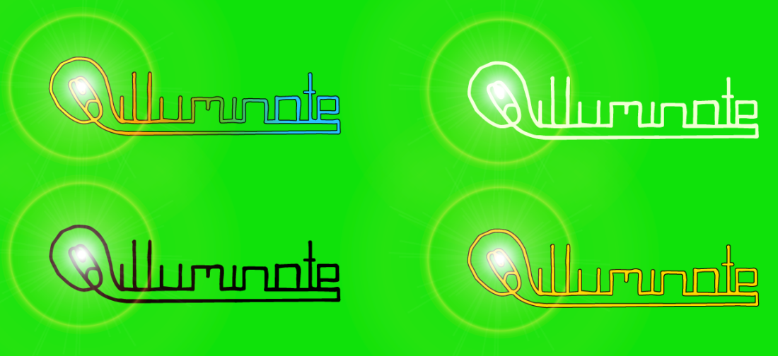
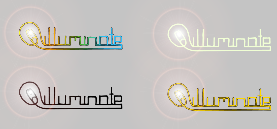
Logo designs with different coloured background
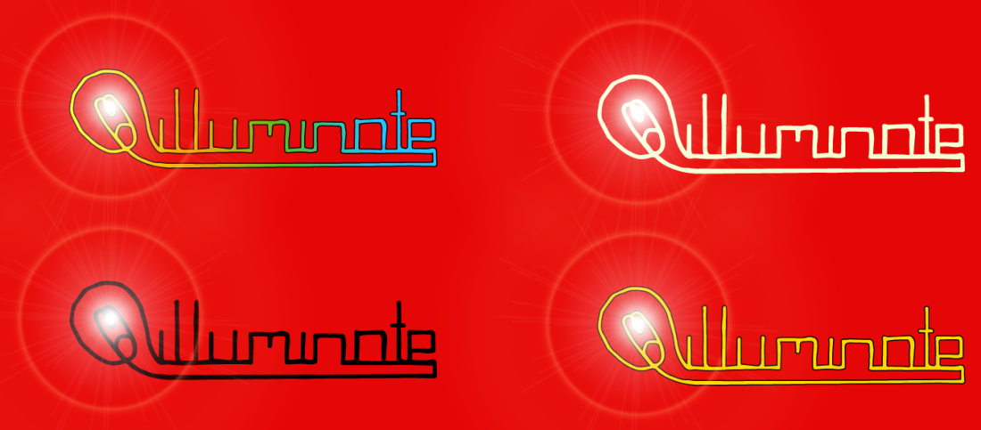
These are my digital logo designs but with different coloured backgrounds. I changed the colour of each background so I could see which one looks best, so I could use it for the background of my poster. I also changed the colour of the text, this was because if the background was blue and it be harder to read because of the blue part of the gradient.
One thing that was bad about this was that I have to have a background, so it cannot be white. This is because if it was white then you would be able to see the grey part of the flair, and it doesn’t look very good.
I like the grey background because it is a light grey and is fairly close to being white, the others however, would be a good background for merchandise e.g. t-shirts. I also the text with a black outline around because it makes it stand out a little better, also, the gold text looks good because it seems more premium.
Illustrator logo designs using fonts
I made these designs using Illustrator, I just typed in the name of the festival and the changed the fonts and colours. I like the first one because it is clean, easy to read and simple. The colours contrast each other so it makes it all stand out and the black outline makes it look clean.
I don’t like the second one because it looks too childish, there are too many colours and it isn’t that easy to read, due to the font.
The third one is good because it is simple with the use of one colour and it is easy to read. The black scratchy outline is good but it doesn’t really suite the theme of pop.
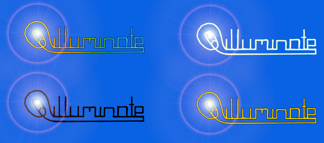
Illustrator design, changing the colours from hand drawn logo
This is the final logo design digitally created using Photoshop and Illustrator. I scanned the hand drawn logo into Photoshop so I could get rid of the background and then copied it into Illustrator. The advantages of using Photoshop and Illustrator are that you can easier edit the image and change as much as you like.
The first 2 images are just the hand drawn logo but the colour is changed. The 3rd image has a gradient of 7 different colours, the yellow being on the light bulb side because yellow is the colour that is most related to light.
If I was to make this again I might remove some of the colours so that it looks a little more simpler and appealing to the eye. At the moment I think there are too many colours going on and it would look better with fewer.
Texture design for Pop festival
This texture was made by a metallic paint, it’s properties are wet and it takes a while to dry. I firstly painted a small amount onto a piece of paper and then put another piece on top to flatten the paint a bit, this also gave the paint a slight wavy effect as I removed the paper away from me. The metallic is shiny so it fits the pop festival theme and I feel it would fit into my final design nicely. If I was to do this again I might try to add different coloured paints, I would do this just to add a little variety into the texture.
Blind drawing
We had to draw an instrument that was in front of us without looking at the paper, these were drawn with a fine liner. The advantages of using a fine liner is that it is fast drying, this means that it wouldn’t smudge easier so it wouldn’t ruin the work. At first I didn’t think it looked very good but it was actually hard to draw a good circle without looking at the page. I think that both of the images look similar to the actually instruments with the right shape. The main difficulty I had was that I couldn’t look at the paper.
My own logo design process
This is a page of logo designs that I might want to use in my final design, the name of the festival is going to be called “Illuminate”. I just drew out a load of possible ideas and used different typefaces. Also, I added some possible images that I might want to use, I think that the light bulb would be a good image to use because it is related to the name of the festival.
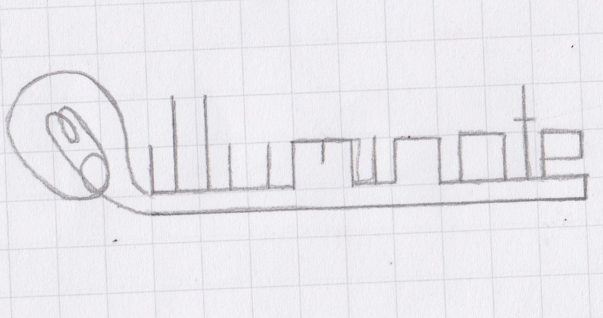
This is the final logo design that I went with. I chose this one because it is clean and easy to read, also the light bulb image fits nicely into the text from the glass and filament.
I had the thought that if the logo was a neon light then it would look pretty cool because it would also relate to the name of the festival “Illuminate”.
This is the final logo design but drawn in fine liner, this is so that it looks finished and when photocopied onto the computer it will be easier to edit in Photoshop.


