

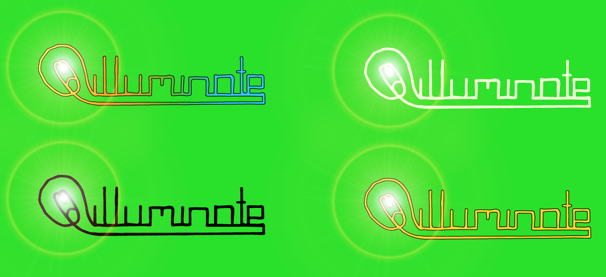

These are my digital logo designs but with different coloured backgrounds. I changed the colour of each background so I could see which one looks best, so I could use it for the background of my poster. I also changed the colour of the text, this was because if the background was blue and it be harder to read because of the blue part of the gradient.
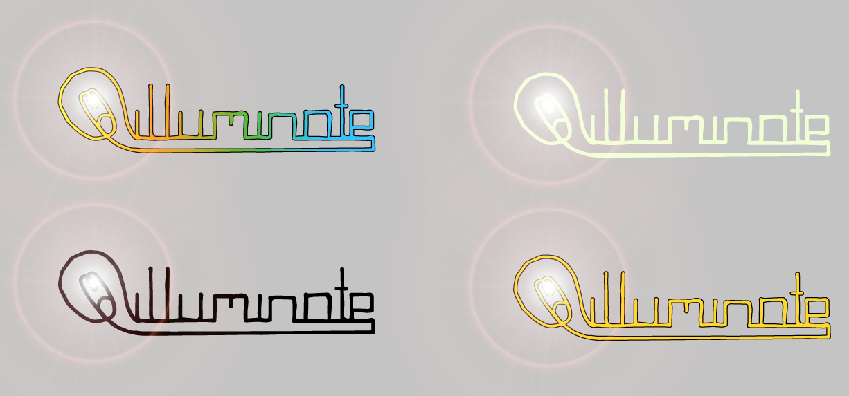
One thing that was bad about this was that I have to have a background, so it cannot be white. This is because if it was white then you would be able to see the grey part of the flair, and it doesn’t look very good.
I like the grey background because it is a light grey and is fairly close to being white, the others however, would be a good background for merchandise e.g. t-shirts. I also the text with a black outline around because it makes it stand out a little better, also, the gold text looks good because it seems more premium.
